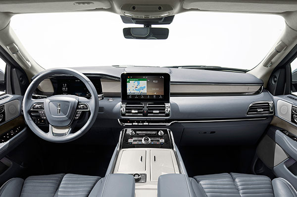
2018 Lincoln Navigator interior
Last Updated:
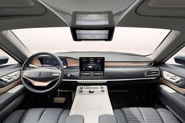
I just wonder what happened to the really cool steering wheel concept design (Top pic)
Otherwise, I must say, they stayed pretty close.
I mean it is not as good and classy as last year’s concept, for sure. (Just look at the door panels.)
Everything seems to be a heavy handed version of the concept.
Plus cheap looking shiny plastic bits everywhere etc…
But overall, it’s not as horrible as the Continental interior.
And most people will have forgotten the concept anyway. So they’ll never know …


I think it looks really good, better than the Continental.
I do have a nitpick though. They should have used a touchscreen display with a thinner black surround. The black surround pictured is huge and makes the display look cheap.
Designed in the Yucatan Peninsula area cause it's definitely yucky
Yes about the giant black surround on the screen.
WTH???? No one does that anymore. A waste of space!
Thoroughly modern, I like this alot
I think that as concept translations go this is pretty good. The reality is that production methods need to be realistic and cost effective and cutting things out will always happen.
I think you actually just like to complain about Lincoln. Seems like they're doing a better job than most automakers. You're not even that mean about Volkswagen.
Hard to fault this look! Close if not better then a Bentley or even Rolls interior at 1/4 of the price!