2018 Toyota Camry
Last Updated:
Like it or not, the new Camry is a huge deal. Always is.
As it has been for many years, and still is, the best selling car in the country.
This is, of course, the most modern Camry ever. but yet again, it seems inspired by the current (also new for 2018) Lexus LS sedan.
Which I guess was never a bad thing for Toyota.
Engines are surprisingly “old fashion”. With the return of a base 2.5 Liter engine. And even a 3.5 Liter V6.
With of course a 2.5 Hybrid.
No plug-in version announced.
And of course, as soon as it comes out, it will be everywhere.

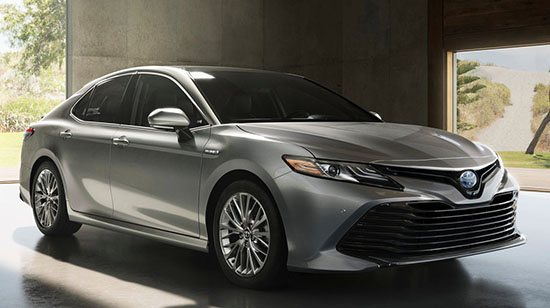
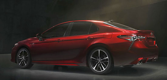
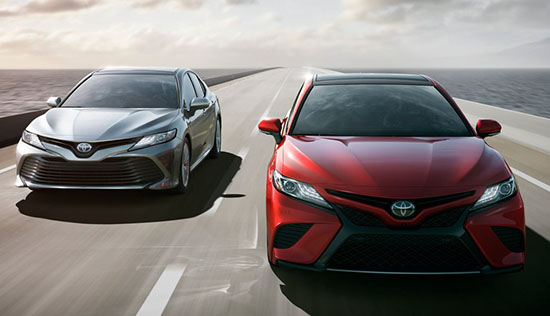
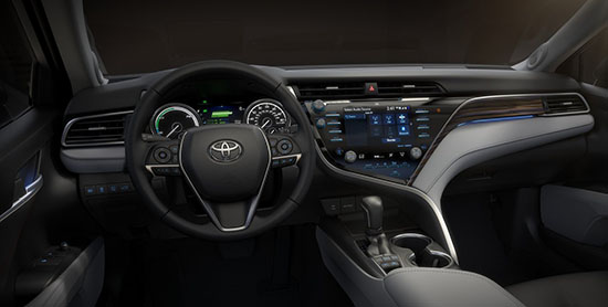
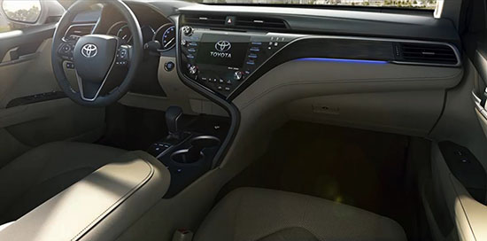
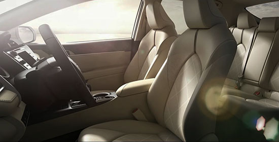
….and with driving dynamics vastly improved, it raises the bar for everyone.
Both engines were revised, they are not carry overs. Finally, Toyota has upped their game with the Camry. Looks good in my opinion.
The dash is so horrific I threw up in my mouth. I need to go home sick. Thanks Toyota.
I'll never be onboard with the drip tail lights. THe dash looks like a mess to me as well.
what a complete design disaster, trying way too hard due to increasing pressure from competition. This is a no go and if any toyota history tells us, their cost cutting will show severely in the areas of quality , noise and harsh materials.
This thing looks both boring and ugly at the same time.Congratulations,Toyota.That's quite impressive.
The profile looks like the Mazda 6 2 generations ago. The detailing on the front end is trying too hard and pretty ugly. The asymmetrical dash is just wrong. But to be fair, this is much better looking than the Prius.
Dash is different but compared to any other dash in their current line up this is a million times better.
Looks like it caught something from Lexus.
The sad thing is is that people will buy it in droves just like that new Prius. I don't think the masses of car buyers really care about "good design."
I think it's pretty good for a Camry. At least they've added a bit of depth to the design with the rear fender bulge and c-pillar crease, there's more to it now than just angry headlights and a gaping maw.
Camry's sell in spite of design–not because of it. Obviously. Their position as the "McDonalds of trendy automobiles" is secure.
The dashboard cannot be unseen!Dr Kevorkian I need you now!
What's with the front end on the silver one?? It looks like a bumper car. The dash is horrendous!
Unlike the last change, this one at least looks better than its predecessor. The Corolla looks to have hit bottom and come up a bit as well. Still not best in class, but at least better than before.
I have a feeling in my gut that there's some awful taillight experiment gone awry lurking in the shadows of the red car pictured, and the hood is over-sculpted, but, all-in-all, this is a nice step forward for the Camry. No it's not groundbreaking, but it's pleasant enough, despite what the design experts above might think.
I thought the dash was nice also. Perhaps a bit too Prius-ish, but still nice enough looking in these photos. A little different, which I have to give them credit for.
no one is buying sedans, toyota is losing ground…In Canada for Example the Rogue outsold the Rav4 and thats a huge portion of that market.
Sub prime buyers don't care about design. This is mediocre as hell, but will sell millions because it's cheap and because Toyota offers constant Toyotathon pricing and incredibly flexible financing.
As of the end of Novemeber Nissian Rogue sold little over 35,000 units in Canada. Compared to Toyota RAV4's 45,000 and change. Those are the polk numbers. The Rogue is garbage and not a contender.