2017 Lexus IS
Last Updated:
Another horrible design.
And yet another proof that Walter White is not dead. That he is alive and well, and indeed providing tons of blue meth to the Lexus design crew.
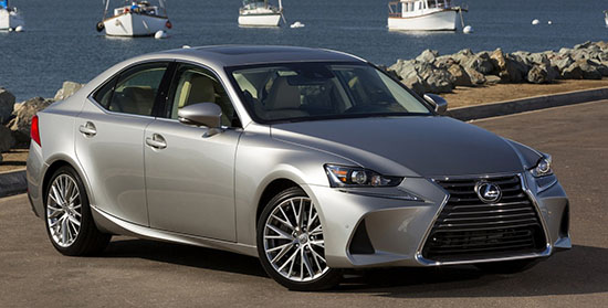
That new front end (Top pic) is just hard to describe.
The rest of the car seems the same. So, just like they did last year with the GS, the new front end does not fit AT ALL the rest of the design.
It now looks like a hamster trying to shove as much seeds in its mouth as it can.
Or some sort of weird vacuum cleaner.
Why???
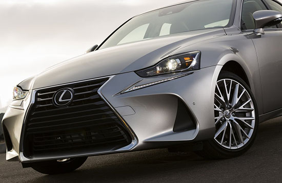
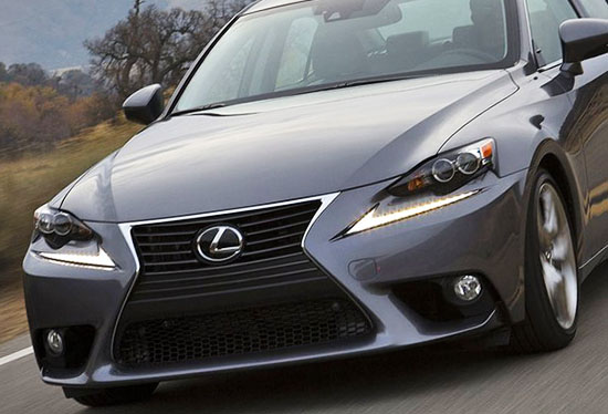
Here it is up close. (again, new one on top)
And again, why?
The end of the LED “point” now is way off from the grille “pinch”.
That grille design is getting more and more disturbing every time they revise it.
And these giant air vents on each side?!
Please fire somebody.


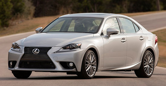
I have to give Lexus credit…the new design makes the old design look better. Not sure why they would do that, but it's a resounding success!
a Corolla by any other name……………(is still just a corolla.)
You can hate the Lexus IS all you want but it's NOT a Corolla.
It actually has nothing to do with the Corolla.
It's a completely different platform (RWD Vs.FWD).
Does not use the same engines. different design, interior etc…
The only thing for sure we can say about it, is that it's NOT a Corolla.
This makes the old one suddenly beautiful. The headlights no longer match up with the LED swoop. I wonder if this will be a cue carried into the next gen.
I absolutely HATE those headlights.
Lexus, the brand for mentally disabled people with money to blow.
Another boring Toyota with nightmarish plastic caps on each end. Seriously, this thing has more plastic crap hanging off of it than the nastiest Pontiac Grand Am GT from the 90s. It's shocking that this messy grille design has lasted this long.
This makes the older one look better.