2016 Audi A4
Last Updated:
OK… This is horrible.
I mean really. This is in NO WAY better looking than the current model.
Of course, it is lighter, more fuel efficient, and has yet another Audi take on “new” headlights.
But this is supposed to be an all new car.
Even BMW does a better job. This is by no mean “ugly “. That’s not what I mean.
But an all new car should look maybe at least 5% different than the one it replaces.
There is no excuse for this crap.
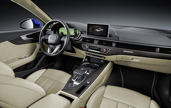
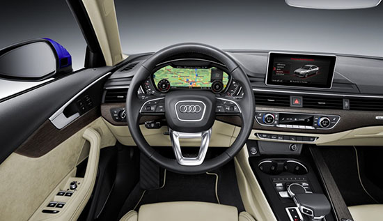
But wait, there is worse! Inside.
Look at this.
I mean this is worse than the current interior. By far.
The new Audi interior design theme was previewed by the new (And equally horrible) Q7 interior.
Sure, the plastic must be of high quality. Etc…(As they are now). But look at the flat, uninspired dash. None of that interior looks as good as the current one. And there is either too much metal trim everywhere, or too much wood!
I mean just compare this to the new C Class interior. (!!!)
Audi is slowly but surely, replacing all its models by worse looking designs. (A3 Hatch, Q7, R8 and now A4).
It’s is shame.

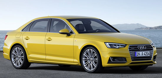
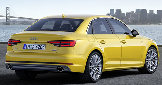
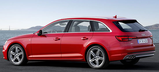
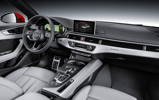
After I saw these pics earlier today, I've been waiting for you to post, Vince. I agree, so disappointing, if absolutely predictable.
I still don't like its interior, but the new little Jag has a nicer stance than this, and looks more premium.
Agreed on all points. And qood to read I 'm not the only one thinking the interior is a mess, despite those screens that make fan boys excited….
Agree with you 100% Vince. I don't understand why Audi gets so much respect. I mean, they haven't had a new design idea for decades now. Oh my bad, they squared off the grill…how bold! Their cars are B O R I N G.
I think Audi did a little more than "5%", but it is a severe regurgitation of a very tired sedan design for the brand. It doesn't surprise me, though. Audi had been phoning in most of their designs for years now. If it wasn't for the headlight/taillight clusters, the fact that the side mirrors are now on the door panels (instead of nestled in the front corners of the side windows), the grille, and all of the straighter edges, it would indeed be very difficult to tell that this is a new edition. It will still sell because it's an Audi. If that's what Audi is gunning for, then I say they succeeded. I personally think it's a snooze fest design.
As far as the interior, the only element that bugs me is the part where the air vent ridges are carried over the dash board. Other than that, I think the angularity of the new dash does fit in better with the exterior design of the car.
Audi has squeezed the hell out of the existing design, which has been around almost 10 years. Time to change it?
Complete waste of money. Lipstick on a piglet (a VW rabbit/golf/jetta piglet) Any car too small for me to fit in the back seat doesn't need back doors. And if I have to move the front seat tight to the back seat to fit in–it also doesn't need a back seat. Fancy trim & a price tag over $25k NEVER belongs on a thing this tiny & useless. And its also too fat (heavy) to be of any use as a golf cart. Kinda the worst of all nightmares. Did I say "waste of money"?
I have to say, the A3 even has a nicer interior than this.
thats the finest Skoda taxi cab I've ever seen
Audi has a different philosophy than, say Lexus. Audi knows what they stand for. Audi customers know what Audi stands for, and it is not "Look at me!" styling. Granted, it is a conservative approach. But this car is handsome, period. Not dynamic like a 3-series, doesn't scream luxury like the C-class. Audi is 'sophisticated'. There is enough difference between gens for people who care (owners) to tell them apart. I think the double arrow headlights and clamshell hood cut, while subtle, accomplish that. And the functional improvements are important, too. But let's face it, the A4 of 2020 is going to look a heckuva lot like the A4 of 1994. How many models can say that? If you want fancy changes every gen, you're looking in the wrong place.
Looks like a fancy Passat. (Like it always has).
June 29, 2015 at 2:24 PM I disagree completely. Audi went from obscurity (prior to the 1980's) to the front of modern design about 25 years ago. It was ground-breaking; yet understated. But they haven't upper their game since. They're resting on their laurels–and it shows–badly! It's gotten old and hackneyed and painfully redundant. And I, for one; have lost all interest in them.