Lincoln Continental Concept
Last Updated:
A few weeks ago, I thought the rumors were a joke. A new Continental???
But here it is!
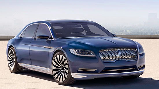
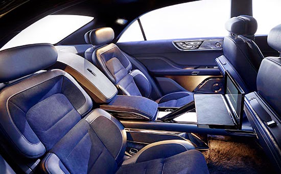
From these pictures, a few things do bother me (already…):
-A new face? Again? the current one is only a couple of years old. So this would be the “newer than new face”.
Just pick one and stick with it for a bit! (Plus, this one looks a lot like the current Jaguar face)
-That “new face”is… rather blunt. Almost vulgar to me. The chrome is just too much.
-Are they going back to names now? No more MK something?
I mean, I do like the return of “Continental”. Always thought MK was quite ridiculous. But again, pick one!
-Is this above the upcoming redesigned MKS? Or is it actually replacing it.
(I don’t really see Lincoln competing with a high end Mercedes or Audi yet.)
-And… It actually does not look like a Continental. Why even use the name?
The production model should be out next year, powered by a new 3.0 Liter Ecoboost V6.
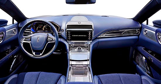
With, hopefully, less chrome inside and out.


Damn Chinese will copy anything.
Wait this is the real thing? April Fools? No? Well dang it if it isn't like that Buick concept from a few weeks back: one borrowed styling cue after another.
Vulgar is oh so appropriate. So is boring.
Very nice, if just a little bland. A lot of last gen Audi A8 in this one.
As A Ford stockholder I'm shocked and angry how poorly executed this design is…I see a chrome encased Fusion dashboard…Lincoln has completely lost its' way and either come up with a "must have" design or give up the brand
EXCELLENT! (At least the exterior) This is what the MKS SHOULD have been!!! The dash is cheap–but nothing that generous amounts of real wood veneer wouldn't rectify. Love the grill, tail lights, green house, etc. Fix the boring dash, add some wood on the dash & doors, and let me know where I can take delivery!
Why are you shocked that they are using an old name on a new car that doesn't look anything like the original? Do you not know about the Ford Taurus? 🙂
Ummm…. Aren't we jumping to conclusions a bit early? This is only a pic of a CONCEPT! Doesn't mean what we see will actually appear in the production vehicle.
Everyone is throwing darts at a car that hasn't even entered production!!
Looks like the Chrysler 250, combining the best and worst traits of the 200 and 300 – not a compliment. At least it looks like Lincolon is appropriately going after Buick, not Cadillac, and certainly not any German car.
If it looks just like this I will quickly trade my BMW 5-series in for one–and have an after-market customizer wrap the dash & doors in real wood. That's all it really lacks — the refinement of real wood!
New Audi?
I think the exterior looks awesome! I do have to agree with you about the grille. Why not stick with Lincoln's current split wing grille design? I think the grille design on this Continental Concept is just a tad to busy.
The interior design is fine too. I think the center stack and console is a bit too shiny, but my assumption is that this would be toned down on a production version anyway.
If the production version of Lincoln's new fullsize sedan comes close to the promise of this concept, then Lincoln will definitely have one cool looking entry in the segment on its hands.
You are right Vince about that Jag front end. Throw in a bit of upside-down KIA "tiger shark" and that's what this grill looks like. Look at ANY distinctive top luxury sedan worldwide and it's the front end that is the signature statement of the design. This one looks like someone forgot to finish writing his/her signature. What poor, unartistic punctuation!
It also includes a bit of the current MKZ rear corner edge design, which was adapted from the same Ford designer who was part of the failed Volvo-Jag-Rover group. Just look at the rear corners of any Volvo S80 and it's exactly the same precise design cue (though the tail lights have been, wisely, revised).
Worse yet (and maybe this is why Ford released the pics early) is that those same rear corner lines are what make up the next-generation Chevy Malibu (as seen in the sneak-peak photo below this story in your column).
Take a look at this photo link and tell me this new Continental doesn't have nearly identical lines to a Rolls Royce Ghost Mazarine Blue. Coincidental, or?
Speaking of blue, I realize that Rhapsody Blue is supposed to have historic Continental significance, but it's really not a good color for such an impactful result. Maybe it looks better in person, but you have to wonder how many far better dramatic luxury color choices Fields' team had to choose from. And the Ford press photo showing the blacked out glass roof makes it look even worse, almost cheap. It must be from the same paint/trim team that is going to give the 1970s Ford Dove Grey paint color (1N) a new life on the upcoming Shelby Mustang (to be known as Avalanche Gray – 'avalanche' being the operative word. Though more like paint primer).
As a Ford shareholder, and someone who has only owned one car other than a Ford his entire life, I hope this concept gets a few key refinements before it hits dealerships. An improved grill area would be an important step. Afterall, this is only a "concept" as the title implies. Right?
Fingers crossed Mark!
Wait, Bentley wants it's Flying Spurs back!