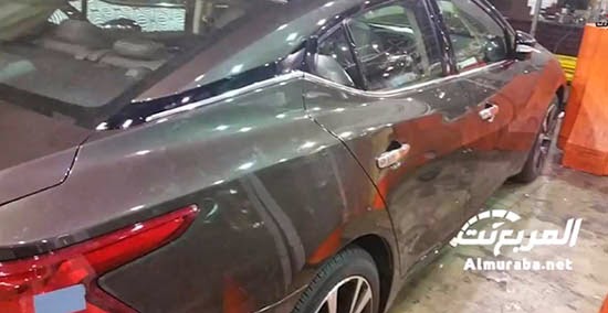
2016 Nissan Maxima
Last Updated:
These are not great pictures, I know.
But from what we can see of the interior, it doesn’t look to me like a Nissan. At all.
I mean the interior design is completely different from any of their current models.
Which seems kind of odd…
I am not a big fan ( I hate it) of the silver trim in cars. You know the plasticky stuff that tries to look like metal.
And there is quite a bit of it here.
I do like the console being angled toward the driver. Like BMW uses to do.
Besides that, it’s hard to say….
Maybe I was excepting something a bit more futuristic.


This is the first glimpse I have seen of the new Maxima interior. It looks to me like very outdated design. There is nothing special to make me put this car on my shopping list.
The interior shows promise.
The face of this thing … shows a need to be gunned into a brick wall.
Most automakers are doing terrible looking interiors these days. I won't say their interior is terrible, based on these pics, but it doesn't appear to be any sort of show-stopper either.
The exterior… well, it appears at the very least that the door handles are pretty much run-of-the-mill. (Details, people. Details.) And the rims don't seem to compliment the design. (All I see when I look at rims like that is: cheap to machine. Then I think of high school age kids… and slammed Civics.)
One final note, and that's I don't believe that this is a good color to showcase a design like this. I hope Nissan will offer more than the typical boring *** white, gray, black, etc. that's popular with the masses.
That interior is very Kia Optima-ish.
Ugly has a new name: Maxima.
This thing is GROTESQUE.
Vince – Check the typo:
Like BMW uses to do.
it's like driving a piece of cheap costume jewelry.
Can't wait till you all eat your words!