Audi Prologue Concept
Last Updated:
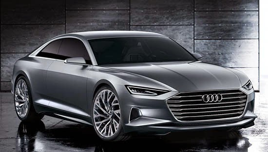
So this is supposed to show us Audi’s new design direction for its upcoming production models.
I guess, except the new Q7 since that was designed quite a while ago…
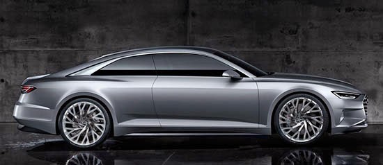
From these pictures, I can’t decide if it is gorgeous, or just another version of Audi’s boring designs.
It sure is different from the current Audis. But at the same time, it feels old.
Almost retro. Especially the rear.
The front is not that new, really. The grille is basically just wider.
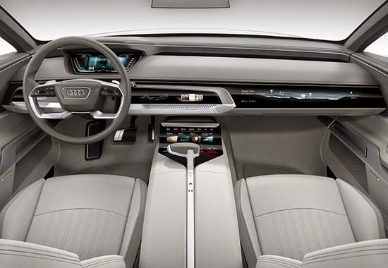
And the interior is as cold as a hospital. Again, on this picture.
The lack of any curves is almost disturbing. It feels very robotic.
I guess I will have a much better idea when I do see it in person.
And take my own pictures too.


the reason it 'feels old' is that Audi's form language since the first A4, TT and R8, has been ultra-modern. That was the whole point of their clean, uncluttered, Bauhaus designs. But, critics demanded CHANGE! So, add back some complexity and bulges. CHANGE! Still quite beautiful – i don't think Audi is capable of poor design – but a sea change from the geometric principals they've relied on for nearly 20 years.
Man, can they make the grill larger?
(That Fusion's going to look great with a front license plate.)
Love that rear bumper too.
Seriously, about the only part that looks interesting to me are the headlights and the chrome trim on the c-post.