2015 Toyota Camry
Last Updated:
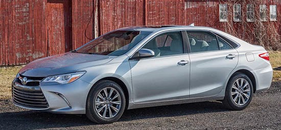
Toyota has done quite an amazing job for what is still a “mid-cycle refresh”.
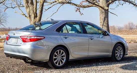
It pretty much looks like a new generation car. And no prototypes of this were ever seen, anywhere!
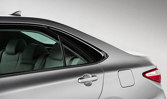
I think this does look much better. The only weird element is the C-pillar. I am not sure what is going on there.
It just looks really weird and doesn’t seem to fit the rest of the car…
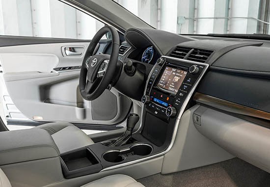
The interior isn’t as new. But it seems really fine. At least on the pix.
(although that blocky looking center armrest could have been redesigned…)
I think Toyota did quite a job on this one…

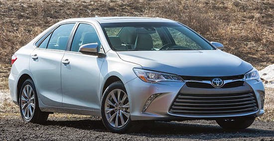
It's better than the current Camry. But it's still quite revolting. Especially compared to the competition.
Well what is going on is during a mid cycle refresh they can change the rear end, front end and side panels. What they do not change is the greenhouse. So with such drastic changes elsewhere, the angular greenhouse was out of place and all they could really do was this black out treatment that looks like absolute CRAP.
Agree weird C-pillar and back B-pillar seems bit weird (retro styling?).
Although front looks like taken from Avalon mostly remind me more of plasticky Corolla front.
Interior is still quite utilitarian. I think Honda has much more inviting high tech interior (and that's not even most high tech you can get in this class).
Umm…Is this a bad imitation of the Sonata?
Don't like it at all. Looks like a Honda Accord from a few years back. Interior is fine.
I think the current Chevy Malibu is well ahead of this one (at least aesthetically), dynamics may be another story, but, to be honest, I don´t buy a car in this class to feel like Sebastian Vettel when driving, then, i stick with the Chevy…
Since Toyota designers have transformed Lexus vehicles into some of the ugliest cars on the road, it makes perfect sense that they would do the same for Toyota. Nice front end guys!
Looks like Grandpa's got dressed up for Halloween.
"Why they do not change is the greenhouse…"
Because the greenhouse is part of the unibody. Changing the unibody is considerably more effort, time and expense. Also, when automakers just change plastic pieces and non-structural components, they often avoid the need for new crash testing.
This has always been a hideous car, from stem to stern. As a result, they've tried to beautify the Camry with camouflage. And it's arguably more of a mess now than before.
This is way better than Acura TLX. haha
At least their designs aren't that conservative as before.
Are you kidding me?! What's up with the quintuple chin grille!
The restyled front and rear treatments look okay. Basically, they make the Camry look like a larger Corolla and that's fine.
The C-pillar fakeout is the part that bothers me. This has to be one of the most clumsily executed versions of this design element ever (besides the one on the previous gen Chrysler Sebring/200). I know it is supposed to be an inexpensive way to drastically change the car's exterior appearance (my guess is that its purpose is to make the Camry look similar to the Avalon), but it definitely looks awkward and poorly integrated into the overall exterior design.
The awkward C-pillar is due to the fact that it's still using the old rear doors and windows and all. They could have redesigned the rear quarter window as well to match the new C-pillar treatment. The bean counters won, apparently.
Dis-Gus-ting. Revolting , a mess. This is so weak and pieced together. Looks like a piece of plastic two way taped to the side to extend window line. This was a 1980's trick . It's a piece of crap. The new Altima is a masterpiece, this is a crap piece of automotive design. That front end is sickening.
Horrible front end. This makes the Camry look like a much larger Corolla. The interior looks ok but the interior of the Camry was never its strong suit.
Most people buy this people mover because it has a history of reliability and offers very respectable gas mileage.
Expect the loyal buyers of Camry to continue lapping this muck up. However, today there are now better alternatives.
If that is really the new steering wheel, then Camry just lost a lot of sales. Their customers have always preferred 4 spokes to 3 and were one of the last sedans to offer it. Oh well, they didn't do their homework again.
Bottom feeder
I can't believe I'm going to be seeing this monstrosity all over the place. This thing is UGLY!!
Maybe Toyota got a deal to sell it as a "New York Taxi" replacement…
Sad. The current Camry didnt need this much work. It was a good looking , clean design.. New led tail lamps, led headlamps and fogs, a new updated center stack and infotainment and better quality seats. This is overkill that now needs a barf bag for every airbag this car offers.