Land Rover Discovery Vision concept: already more pix
Last Updated:
Better than the 1st one, but still.
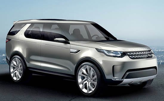
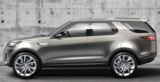
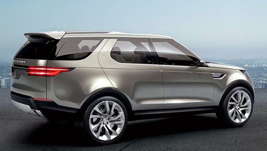
The real car would look much better than these “rather cheap and obvious looking” computer generated illustrations.
Besides that, I really like the design. And hope most of it makes it into the production car.
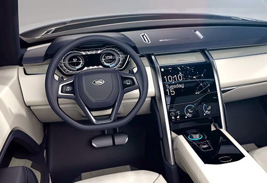
The interior is very simple and classy. Nothing feels cheap or showy.
I especially like the simplicity of the “music” and “phone” buttons on both sides of the steering wheel.
It has an “Apple” feel to it in its design.


Excellent example of a updated, clean, modern, harmonious design. Just like the Evoque, the lines and angles flow cohesively together. Confident British understated timeless elegance. It moves the current design forward without becoming a victim of fashion compared to the current trend. Example of which is the Lexus "LOOK AT ME" abstract desperate for attention design language.
The LR Disco should not resemble the vehicles on the Range Rover side of the business. LR's should look more rugged and functional.
Looks like a copy of a Ford Explorer which is a copy of a Land Rover.
Looks like a Ford Explorer to me.
I didn't know you could feel the interior of a car in a photograph through the internet.
I'm sorry, it's fucking boring.
Looks kind of like a Saab?
Wow does that look like something that Ford designed. Are you sure they sold them?