2015 Hyundai Sonata
Last Updated:
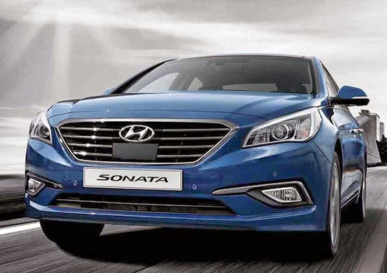
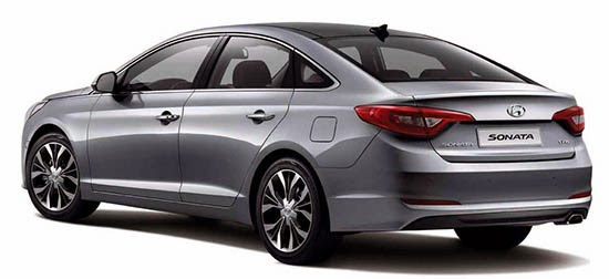
In my opinion, this is a big step backward.
It looks like a more boring version of the current model.
It doesn’t look new (although most “new” cars don’t these days…).
It looks like it came out before the current model.
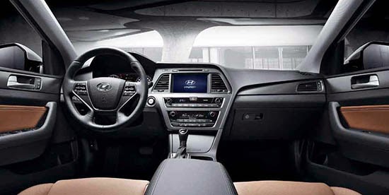
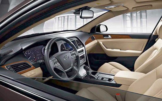
Same thing inside.
I don’t get it. The Sonata is a big hit for Hyundai. And the current design pretty much put them on the map as far as mid sized sedans are concerned.
I don’t understand why they would now come up with this.
While the current model was one of the most modern looking sedan, this is now one of the most conservative.
I guess they see the Camry and Passat as competition now. Instead of more modern cars like the Fusion or Chrysler 200.
This one is for the old people.
So similar and yet, older looking.
The new 2015 model is the white one on top.


It looks like the old Kia Cadenza.
You are absolutely right about this looking like an older Sonata than the current one. I knew we were in trouble when I saw the revised 2014 model with the more boring grill and the black painted lower bumper, but this is no good. This looks like the replacement for the 2010 Sonata, not a replacement for the current car. And the interior looks terrible, no style, looks cheap.
People are buying the current Sonata because its a good looking car – even after 4 years on the market – not because they want Hyundai. If the Sonata is just going to be part of the boring car group, then they lose the style conscious customer while the boring car customer stays with Honda and Toyota. All fail.
Giant step back.
Looks like they've completely lost their mojo. Or they're actually trying to screw up their sales. That's really disappointing. You're right, it looks older. 🙁
You should do a before and after of the interior too. What an awful job they've done all around.
Another Ford Fusion hits the road…
This new one missed the mark entirely. The design benchmark is the Fusion, and this is not even close to the aggressive design we've come to expect from Hyundai/Kia, and is not nearly good enough given today's competition.
Given Hyundai's recent reliability reports, misleading fuel efficiency ratings and the unspectacular design, I don't expect this new Sonata to be met with the same enthusiasm that they experienced with the previous model.
I like it. More conformable for rear passengers without sloping roof line.
I don't mind the exterior but I'm so disappointed in the interior. The previous interior outclassed most of the Japanese competitors and a few of the Europeans but the new interior doesn't have any style at all. It will be interesting to see how well this new model does in sales.
It's a So-Sonata or soooo nada good.
…hey. I wonder if you parked it at a Subaru dealership, would anyone notice?
I think it's better for these reasons: The "swoop" character line on the side begins higher and even with the top of the front wheel opening. The existing "swoop" begins too low making the front end look heavy and disconnected. The new profile is cleaner and unifies the whole side view without the deep shadow created by the deep swoop on the rear door and fender on the existing Sonata. The front end is crisper and more sophisticated. The roofline appears to be a bit longer and probably a little higher for more back seat room which was a flaw in the existing Sonata. The dash is more tailored and driver oriented. Overall the existing Sonata is like someone dressed for a rock concert. The new Sonata is like someone dressed for a symphony. I predict it will sell very well. Besides, pics never do justice to modern cars. I saw hundreds of pics of the existing Sonata and was skeptical, but when I walked up to one in the showroom I went, "wow" -then when I opended the door and saw the dash I went, "holy cow". I'm sure the new one will create the same reaction once it hits the road.
I'm sure hertz, enterprise, etc, will love it.
If this is the result of Peter Schreyer being in charge of Hyundai design, then please bring back his predecessor. The exterior is a modest step backward but this interior is positively 80's retro!
Isn't the new profile similar to the 2015 Subaru Legacy?
I actually like the new exterior design. It has a quasi-fastback profile to it. The new front end sharpens and solidifies some of the droopy "melted" look of the current version. I wish Hyundai would have incorporated the door handles into the side creases on the new version like they did with the current car, though.
I have to agree with you on the interior design. It took a big step backward in terms of overall appeal. I hope the fake wood accents don't appear on the U.S. version; they make an already unimaginative interior design look so much cheaper and downmarket.
My overall thoughts are that the exterior design is fine, but the interior is disappointing.
I agree that the old front end was garish and over the top.. especially the fish-faced Hybrid.. and this one seems to be an improvement. But IMO the rest of the new car has been sharpened up, straightened out.. and overall dumbed down. Maybe they're trying to give people a reason to pay more for the more stylish Azera or Genesis other than the V6 engine.
Ford Fusion "wanta-be"
Hyundai is absolutely shameless about stealing other's designs. Another reason NOT to buy one.
This is a much improved design and will have wider consumer appeal. Plus this will age a heck of a lot better than the current swoopy, droopy design.
The only negative is the average gas mileage of the Sonata which doesn't come anywhere close to matching the Camry or Accord.
For Hyundai's sake they better have fixed the steering and suspension system on this car which seems to be a trouble spot on many of their vehicles.