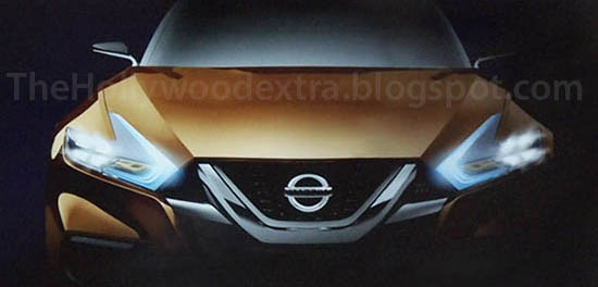
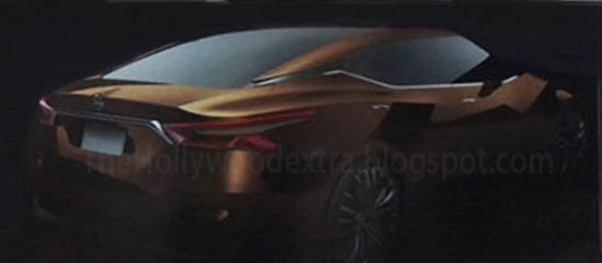
More pix of the Maxima Concept
Last Updated:
I call it the Maxima concept. Because I think this has to be the next Maxima.
This is really nice and modern. Let’s hope Nissan doesn’t water it down for the production model.
They do need something to stand out, as most of the competition looks really good already.


I have to say. The side character line that falls behind the front wheels – which Nissan now uses on the Sentra, Altima, Pathfinder, several of its concepts and now this "maxima". I think it looks awful. It is pointless and counter productive.
Besides that line… there is nothing remotely attractive about this drawing, except for the wheels, proportions, and overhands that will never see the light of day. Once this design is 'production-fied' its true awfulness will be apparent.
OUTSTANDING !!!!
The first poster is a wanna be automotive critic, what a loser!
I can't wait to see how this pans out. The more I look at it, the more I like it.
By the time it's released it won't look as good and as usual from Nissan everything inside will be low quality
every Nissan interior is , in my humble opinion, top notch. I work for an auto group that has mercedes, toyota, infiniti, nissan and audi vw. The Nissan interior "Is" top notch, bar none.
I'll give you the new pathfinder because they did do a better job there updating it to an infinity like interior but other than that they use very cheap hard plastics similar to what hyundai/kia does except they mix in some nicer textures on the dash I work for a rental car company we get a little bit of everything
-MM
The first poster is a wanna be automotive critic, what a loser!
…at least he did not pollute the site with crap like yours.
…at least he did not pollute the site with crap like yours.
Hahahahahaha
Awesomeness. Please be the new Maxima.