2014 Chevrolet Camaro
Last Updated:
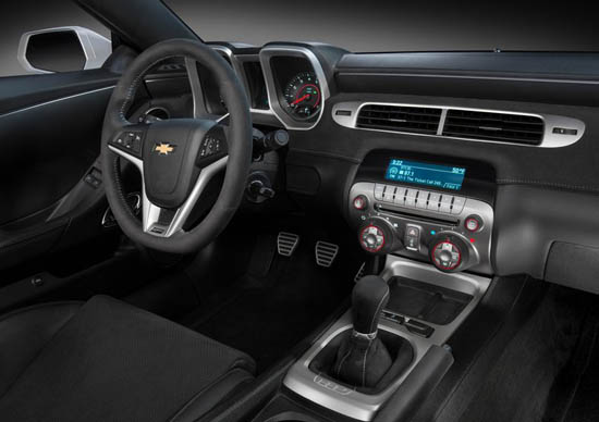
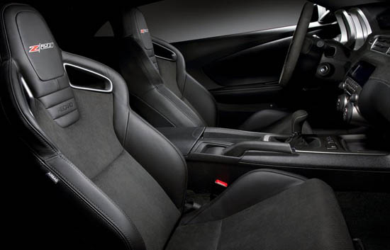
Too bad for those who were hoping for a new interior.
The current one actually never bothered me. I find it so much better than the horrible Mustang interior.
The only thing I miss is the original steering wheel design they had a couple of years ago. Which was much more original than this corporate looking one.
Otherwise, I think the new grille works. And the new tail lights make the rear end a bit cleaner.
Nothing is really an improvement. I guess they had to change something without spending too much cash.
Since there is an all new Mustang coming out next year….

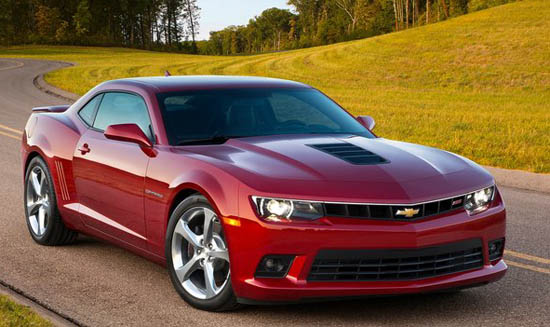
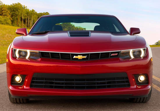
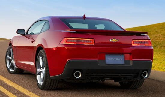
Still looking as muscular/handsome as ever… Nice to see refinements to the front and rear ends.
As far as the interior goes – No, they didn't change it, but then again it's modern/retro vibe still suits the vehicle.
Not really digging the tail lights. Not really a big fan of the car overall, new tail lights makes it look like a Prelude from the rear now.
GM should be ashamed of themselves for giving a handsome car such an offensively cheap interior. There really is no excuse for this.
All 13 year olds and those with mullets rejoice!
The Camaro still outsells the Mustang, so we'll see what happens when the new models go on sale!
Also, for some reason my first reaction to the new rear end was last-gen Honda Prelude
I agree with the other posters. The rear end looks exactly like a Honda Prelude. Ugh. I'll have to see it in person as there is clearly some sort of "circle" feature included in those tail lights, but it is hard to determine what they look like by those picture. I'd say this is a step back.
Sigh, I miss my red 98 Prelude…
Is GM capable of producing a quality interior. I think the Mustang uses much nicer materials and is a much nicer design…the plastics in GM interiors is shameful.