2022 BMW iX interior: more bad news…
Last Updated:
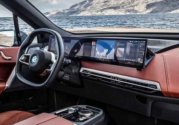
There are so many bad things inside the new BMW iX, it’s hard to keep up. It’s actually a gold mine of horrible design elements.
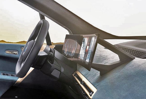
I had almost forgotten about this one: the odd mount behind the screen.
They couldn’t instal the screen, right on the dash? What’s going on there? Why does it have to be so big???
This is just super cheap-looking, and like the rest of that interior, looks handmade in a garage.
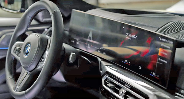
At least, the new i4 sedan doesn’t have it. Does it?
Well, yes and no. It looks like there is still a smaller mount behind the screen. But it doesn’t look as bad as on the iX. Which is a “Festival of bad”…


Honestly I'm kind of into the mount. At least BMW is trying something new with their interiors. The exterior of the iX is a trash fire though.
I guess it’s starship console chic?