2014 Buick Lacrosse
Last Updated:
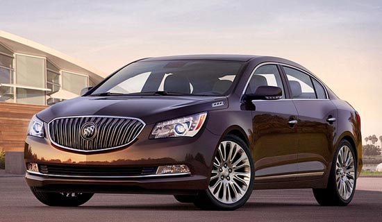
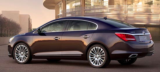
No big surprises here, since these are the same changes we saw on the Chinese version.
It does look a bit more upscale, but also more conservative.
Which I guess is what GM wants for “The big Buick”. Especially now that you can get the same car as the Chevy Impala for less.
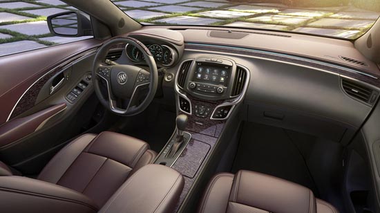
The revised interior does seem more upscale. But again, a bit more conservative too.
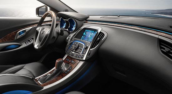
I really liked the angled console design on the current model (lower pic). Now it’s all flat, like anywhere else.
All they needed was to tone down the shiny plastic chrome everywhere. (Which they did also)
We’ll see…


Grandparents everywhere cheer and rejoice!
I love having the speedometer in the middle.. It just makes sense..
The previous grille and nose looked better and more modern…sad. Backwards GM goes….
Why would anyone buy this over the excellent Avalon or the value packed Azera?
I certainly wouldn't.
"Why would anyone buy this over the excellent Avalon or the value packed Azera? "
Hahahaha! OMG, my side…. snort
Oh, wait. You were serious?
Hey Vince, I have the current Lacrosse. LOVE the car, but the only problem is the A pillars that inhibit the driver's view out front. I've nearly run folks over while taking a left turn. So much of the view is blocked. Dangerous, actually. Do you know if this has been addressed in the new 2014 model?