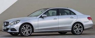
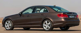
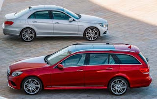
More pictures of the 2013 Mercedes E-Class
Last Updated:
Not sure if the rounded headlights really work with the straight lines in the rest of the car, but I still like it better than before.
It went from “kind of ugly”, to “kind of boring”.
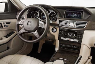
I still wish they had done more inside. It looks like they just added an analog clock…

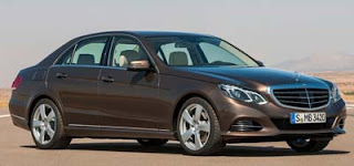
If the original was released with this front, it's doubtful that people would comment on the design being disjointed.
This Car Is Hideous… That Is All.
Boy does this look a mess or what?
Best looking car Mercedes ever built!
that need for a 4-inch head to pass over the engine block under the bonnet… is the head supposed to come thru video screen on the dash? geeesh.
It looks just fine to me. MB customers buy it for the badge anyway with or without a clock.
The silver sedan in particular, with the completely WRONG "Sport" grille (which should have stayed on the coupes and roadsters IMO), looks like a decade-old Infiniti or Hyundai, not a Mercedes.
You should post more interior shots. The seats look cool- kind of retro 80's like the seats they had back then. Love it, it's very "Mercedes" and a classy and classic design they should never have stopped using. It'd be kind of nice if they only used it on the E-Class though, to give it its own identity in the range. Also, the non-lacquered real wood is a nice touch. Someone tell GM chintzy fake plastic wood went out of fashion a long time ago, and with it the real stuff that you could barely tell apart from it.
…all for now
The dark real wood with satin finnish looks a lot like the Chrysler 300 LUX. It's a good look in both these cars.
It's still one of the few cars available with a comfortable 4 spoke steering wheel. They get points for that.
Meh…
I think this thing looks outrageously good. I particularly love the Sport trim, I'd love to see it in white with a gray interior.
Vince, do you think you'll get to drive on of these?
Yes, it's conventional looking. The front isn't revolutionary, and the rear is nondescript. But it's a solid car that looks smart, and no one that buys one has to explain their choice. The E class will probably never win any design awards. Never has, never will. And that's not the point of it.
Horrible. The car doesn't flow. The front end is too curvy and the rear is to boxy. The d pillar is too square.
I hope the move of the shifter is just on the wagon.
Overall this is just horrible, and just something to get people coming off they're leases to be interested in the e class
Problem with making a non descripte car like this, everyone is building really good product now. An expensive car need great styling, engine, reliability, guarantee…..or you just don't cut it in the highly competitive landscape. Style wise this E class is a sleeper.
I can't wait to get one. I love my current 2013.