2013 Mercedes SL
Last Updated:


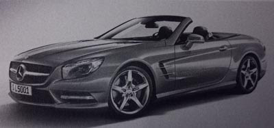
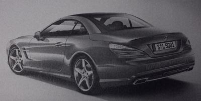
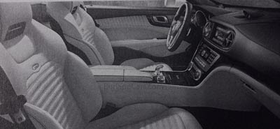
These seem to be from an actual brochure for the car. Which also mentions a December 15th date.
So we might be seeing much more very soon.
I am sure this will be another impressive car in real life. But from these pictures, it doesn’t look that different than the current design. At least outside.
Usually, SLs are quite a leap from generation to generation. Mainly because they keep them for so long.
We’ll see when better pictures become available.
Thanks to a reader for these.

They should definitely call it "Gran sedan". I know this MB
I agree with Vince's statement that SLs are usually a great leap from generation to generation.. but like the last two generations of SLK, it seems the changes to this SL are limited by the functionality of the folding roof. Like the SLK, it doesn't appear that the roof or greenhouse has changed at all, just the sheetmetal around it. Good thing the current model is as handsome as it is.. if anything, the new grille and headlights are a step backward style-wise.
i agree this looks like a step backwards like its trying to look more expensive than look better like the the new cls
Absolutely Hideous!
Mercedes has completely lost its way as far as design goes, and this thing's about as ugly as they come, with that bull dog-inspired blunt nose, and not a single cohesive design-element to be seen.
CLS+G37 Convertible=not good
What is with the flaired out tail lights on every other model as of late?
– FusioptimaSX
I can't afford one, but If I could, I wouln't be looking at this car. I understand that it's not, but it looks like a MCE to me. The sheet metal other than the front and rear clips are the same, so what is going to make a current SL owner want to upgrade to this? These kind of cars are "look at me" statements, this one is bland and that won't help sales I don't think.