2022 Honda Civic sedan: official pix…
Last Updated:
These are some of the official photos of the all-new 2022 Honda Civic.
It is about 1.5 Inches longer. With a longer wheelbase as well.
Specs are very similar to the current model:
– LX and Sport models get a 2.0 Liter with 158HP
– EX and Touring get the 1.5 Liter Turbo with 180HP.
– CVT only
– Touring version gets a 12 speaker Bose system and 9-inch screen.
Gas mileage seems to be slightly improved. But it was already great.
In my test drive of the Civic Coupe a while ago, I really got fantastic real life gas mileage. Much better than the official numbers.
The Turbo was smooth and quiet. And the CVT worked great.
So this is probably a very nice car. The interior is really growing on me as well. I really like some of the details. The exterior is kind of a letdown. But I do have higher hopes for the upcoming hatchback.
A Si version will also come out later, with a 6-speed manual standard.
What do you think?

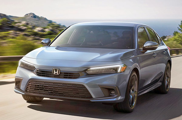
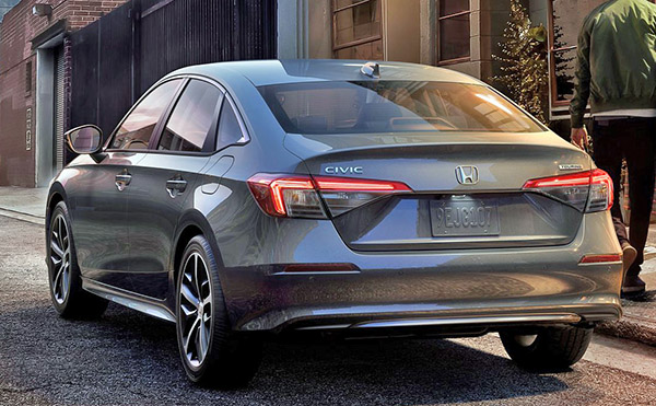
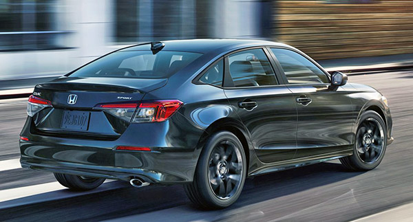
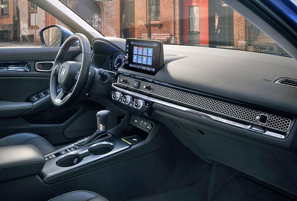
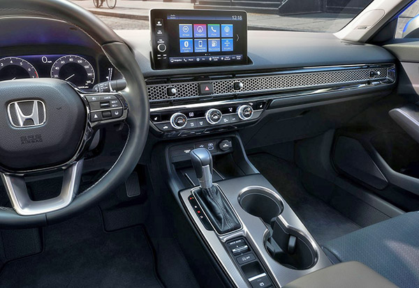
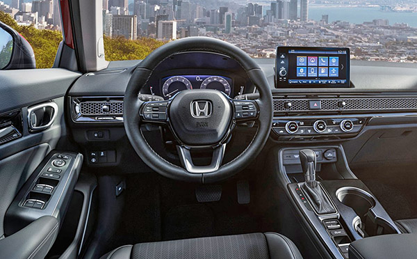

I've already written this one off design wise and the remaining CVT seals the deal. With the exception of the rear taillights, nothing about this car is appealing to me inside or out. What the hell was Honda thinking with the hvac vent tratment? Every other vehicle in the class, with the possible exception of the Kia Forte looks way more modern inside.
I actually really like the honeycomb dash treatment, looks reminiscent of vintage stereo equipment. With the upper grill opening so small and looking like they tried to hide it under that bulge, it would have been nice to just have no grill like the 90's civics.
That "grill" strip on the interior dash is weird and ugly. Though the outside is a little boring, compared to the last one, I think it will probably sell better, if people don't mind that ugly grill dash.
Why does every sedan have this same greenhouse? I can list 18 cars
An industrial designer's take:
Exterior: Clean design without all the random curve craziness and huge fake vents of the previous…. What makes it feel boring, is the similarity to the Accord… but it is a pleasing form.
Interior: Clean forms, with a retro feel… seems like a lot of chrome, though and may not age well. This seems like it would play better with some retro cues on the exterior… but kudos to Honda for breaking free with a new look here.
It's a huge improvement. Probably the best looking civic to date and the audi interior is nice.
This is a nice clean dsign that will age well. The 90s Hondas still look good today. I like how they incorporated the vents in a nice clean line with the trim. Look forward to the hatchback. Still, CVT is a deal breaker for me.
Finally a audio upgrade. Bose is not great but the 450 watt Honda system was terrible. Styling over all is giving me Saab vibes
How the hell do you clean inside of the 'honeycomb' grill? Hole by hole???
Honda photoshopped the pictures so much that the panel gaps(specially around the front face that people have noticed and complained) seem non-existent and surface shadows are so exaggerated for the known FLAT surfaces to make them look super voluptuous. Honda is a lier.
I own the current generation Civic and have been very happy with it. The new one's tail lights look less goofy than mine, but otherwise, the car feels a little boring. Not much incentive for current owners to trade up.
The Accord styling works much better here on the shorter decked Civic. The front clip is simple and yet the upper and lower grilles are fussy and look over wrought. The interior looks nice and the honeycomb detail is Honda's only styling risk, I think it works. Wish Honda would tart up the interior (bold colors, two tones, etc.). I long for Honda when they were innovative (80's and 90's).
The Holiday Inn Express of cars.
Another place to hang your mask, air fresheners, etc. on the air vent knob(s).
Anonymous Anonymous said…
Honda photoshopped the pictures so much that the panel gaps(specially around the front face that people have noticed and complained) seem non-existent and surface shadows are so exaggerated for the known FLAT surfaces to make them look super voluptuous. Honda is a lier.
Idiotic post of the day. So what if they did? Most people don't buy cars sight unseen over the internet. They go see them in person.
Refreshed Forte looks more appealing.
Front is the ugly
Rear is ripoff the jetta who ripped off the sonata…
MMC gonna be coming fast, like the 2012-2013 stint, de ja vue
The honecomb grill strip on the interior is very off putting, I don't think it matches anything else on this extremely conservative car both inside and out. Perhaps it looks great in real life but the whole thing is just a disappointing effort. The Mazda3, Sentra, Forte and Elantra are way better design and refinement wise.
Is the couple discontinued? Is the interior available in a colour other than black?
Honda had announced last year that the new generation will not get a coupe version.
We will be getting the Si version of the sedan with a 6-speed manual. As well as a redesigned 4 door hatchback. Now built in the US. (The current model comes from England)
And Honda will sell tons of it.
I like it. Conservative yet stylish. Hopefully they'll clean the styling up on the next Accord like they did here
i like it, especially the new interior. I do not think the new honeycomb grill strip will be a ''nightmare'' to clean. Use a soft bristle brush and a vacuum. Or buy a can of compressed air from Staples/Costco. No biggie.
– the upcoming Si should be a decent looker. As long as no more goofy plastic fantastic fake air vents and overstyled front/rear bumpers. The 6 speed manual would be the normal delight to shift, but Honda should just offer a damn six speed conventional automatic .
– other then that , it reminds me of a baby Audi sedan.
Keyboard compressed air?