2012 Mazda 5
Last Updated:


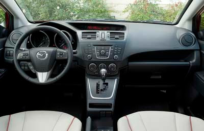
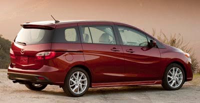
These are pictures of the US version of the new Mazda 5.
It took quite a while to get here…
We’ll see if the wave on the side will turn people off or not.

Last Updated:


These are pictures of the US version of the new Mazda 5.
It took quite a while to get here…
We’ll see if the wave on the side will turn people off or not.
Does it have the Idiot Grin(TM).
Mazdas are designed by 8 year old girls.
Wow. Pretty odd looking. Very old school Korean.
Misses the boat on SOOO many levels. Quality without STYLE is absolutely useless!
Amazed at home many teen age girls consider the Mazda 5 their dream car.
this may not be the end of Mazda
and
it is definitely not the end of the beginning
but
it could be the beginning of the end
I hate to say it, being a Mazda5 owner myself.. but the wave is just annoying enough to prevent me from buying a new one. The horrible new taillights (and the awkward glass intersection where the taillights used to be) don't help much either. Hopefully the Grand C-Max-based next-generation model will get here before mine breaks down!
Goddamn that's ugly!
A shame that they went away from 'Zoom Zoom' to 'Dont Worry, Be Happy'. It will take a couple of years for Mazda to purge the designs of this current silliness. Luckily, Van den Acker (the dutch designer responsible for this) has already left for Renault. If Mazda's smart, they'll redesign all the front fascias and add content to the Mazda 6 and newly released 2 (along the lines of the Demio Sport) to fortify those cars images. Perhaps the restrengthened cooperation with Ford will help them clean up their current models. I like Mazdas so I'll keep my fingers crossed. BTW Mazda – you guys seriously need to review your interiors. Cheap doesnt cut it.
Note to Mazda designers:
First you test our patience with the joker grin, now you place this totally out of character detail on the sides, all I can say is please stop…..now!
Personally I see nothing wrong with "Doing the Wave" 🙂
Up until the 80's-90's many top selling american market cars were flashier/more idiosyncratic than this thing. Seems like America's sense of humor and style has lost out to today's watered down beige, stare at TV/Computer screen mentality.
Is Van den Acker from Amsterdam? that would explain it…They need to change from "Zoom-Zoom" to "This is your car designed on drugs"
Alot better than the new chevy cruise
I think that the side sculpting is interesting, I am sure that Mazda will be doing this on other models, I wish that they had tried it on something sportier before doing it on the 5. I think that the proportions on this car are ackward to begin with and it would take a lot to make this car look good. I rented the current version of the 5 once, and I was impressed with the utility and the quality of it. But it is not a car that I would buy. Judging by how few of them I see on the road, I think I am not alone in my opinion.
Interesting that the tail of this is clearly promising.
Sensible vehicle from a good company, but that wave thing on the side is shit.
Why ruin an otherwise good looking car?
This was designed by a Barbie doll for Barbie dolls.
This is being marketed to women so the "Idiot Grin" and girly design works here…If you want a man's car get a Dodge Ram or 300C.
"Anonymous said…
This is being marketed to women so the "Idiot Grin" and girly design works here…If you want a man's car get a Dodge Ram or 300C.
November 8, 2010 4:49 PM"
Yes, please!
By all means purchase a vehicle that rates at the bottom of JD Power, Consumer Reports, or TrueDelta reliability studies.
Hey, you'll be broken down at the side of the road in a POS vehicle that has some of the worst residuals in the industry. But MAN will you look macho when you are trying to figure out what just broke.
Moronic comment. Chrysler is junk.
Hey "Educate yourself"…so we're now judging design quality based on sales and in Canada of all places to boot! You must be joking, please take some time and read a book about good design principles and perhaps you will educate yourself.
Bring back the Rondo!!!
"Anonymous said…
Hey "Educate yourself"…so we're now judging design quality based on sales and in Canada of all places to boot! You must be joking, please take some time and read a book about good design principles and perhaps you will educate yourself.
November 9, 2010 8:19 AM"
You ever heard that beauty is in the eye of the beholder?
I couldn't care less what a design book tells me. I am sure they would say that daring designs evoke more emotion than boring vanilla Toyota designed themes.
BTW, what is wrong with Canada? I did also mention America just so you know.
Nice try, you still sound like an idiot.
Emotions are for women…Did you not get the memo?
Mazda does in fact design for female customers. I don't know why "men" are getting so upset with the Mazda5 styling. It is styled for women since women make up 73% of Mazda sales.
"Anonymous said…
Mazda does in fact design for female customers. I don't know why "men" are getting so upset with the Mazda5 styling. It is styled for women since women make up 73% of Mazda sales.
November 10, 2010 12:33 AM"
The model matrix mix is near 50:50, as of last year I believe it was 54:46. This was available on Mazda's news/press site.
Debates work much better and make more sense when you DON'T pull numbers out of your …. Nice try trying to troll, though.
You fail.
Up until the 80's-90's many top selling american market cars were flashier/more idiosyncratic than this thing.
Flashy yes; but not ridiculous. This thing isn't ostentacious– it's just dippy & silly.
Comparing a 60/70/80/90 Lincoln/Chrysler/Cadillac to this silly little Mazda is like comparing a life-size Rembrandt to a comic book!
No…Mazda has the highest sales to women of any major brand…They just beat out Honda.
Educate yourself, perhaps you should follow your OWN advice and well … educate yourself!
First, the Civic is the NUMBER ONE selling car in Canada, NOT the Mazda 3.
Also interesting that almost no mention of Hyundai here. Looks like Hyundai paid supporters only post on Hyundai-related topics. They never seem to post in unrelated topics, even if the unrelated vehicle happens to look like a Hyundai with goofy character lines all over the place.
Yes, it has the pokemon/Joker grin:
I love the people who bash the grin and Mazda's current styling. A couple points for those of you who know nothing:
1. The current Mazda3 with its goofy grin is THE BEST SELLING vehicle in all of Canada right now. Period. There is no other vehicle that sells better.
2. The current Mazda3 is the third best selling C segment vehicle in the US, behind the Corolla and Civic. That is pretty strong given all of the competition.
3. Why would Mazda want to change something that is doing well for them? Clearly some Internet blogging idiots have no idea what they are talking about.
4. Mazda has already released their new direction that they are going to go in for styling, called Kodo.
If you'd like a preview of what it looks like, go here: https://www.autoblog.com/news/mazda-shinari-concept-debuts-new-face-of-the-brand-in-style
You can bash the smiley grin all you want, but the truth in the matter is that it is working. Mazda is a very small manufacturer in the grand scheme of things, and for them to be #1 in Canda says something.