2022 Mercedes EQS: more interior pix…
Last Updated:
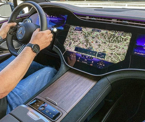
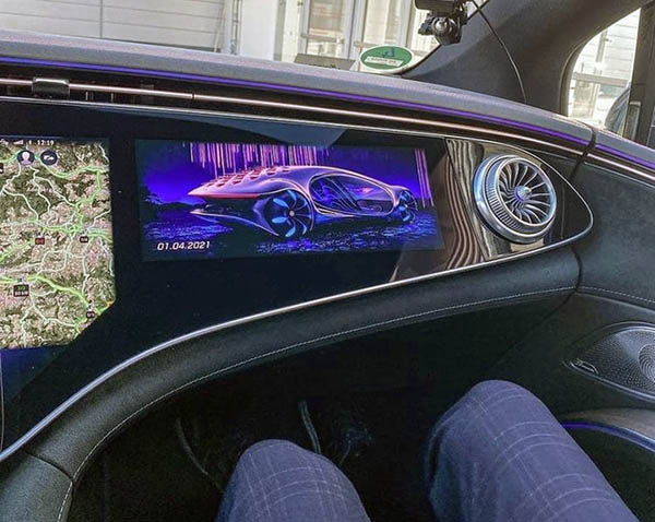
As everyone here knows, I am really not a fan of the “screens everywhere” trend of car interiors. But I have to say, the 2022 Mercedes EQS interior is very, very impressive.
Sure, a screen in front of the passenger is just too stupid to even explain. (It can probably be turned off)
Still, the overall look and feel of the whole thing are quite amazing.
And I really think this is the future of interior car designs. Instead of Tesla’s vision of a minimalist interior with a huge floating tablet. Soon, these huge screens will become cheaper than all the parts they replace. Except for the vents, there seem to be zero moving parts. Eventually, all carmakers are greedy and are just looking for the cheapest way to build things. Screens are getting cheaper every day. A setup like this gets rid of dials, buttons, switches, and even trim.
Whether we like it or not, I truly think the EQS is only the first of many, many others. And, as it always does, it will trickle down to mainstream cars like the Honda Civic and others in a matter of a few years.


Unique, but way too reflective. Can see driver's hand reflected in the center screen.
Do you really think fixing 3 screens that are looked from different directions by the driver and the passengers in to ONE huge flat reflective surface is so impressive and futuristic that the entire industry is going to copy in a few years?
I wonder what the screen in font of the passenger actually does. Is it just a digital photo frame? Can you control the media or the navigation (which would be very helpful since most system lock the main screen when the vehicle is in motion)?