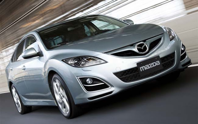
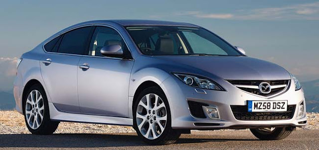
Revised European Mazda6
Last Updated:
They actually didn’t change much. (new model on top)
I still think the previous one was a bit more interesting… But…
Not sure what changes we’ll be getting in the US for 2011.
Let’s hope it’s mild. The Mazda6 doesn’t really need anything.
(Except the hatch and wagon versions, of course…)


This newer one does still look good. I do like the US version but I gotta huge beef with its front airdam. I wish we got the the same front as the Euro version. I also wish we got the hatchback too but we all know how that's going to go. I was also thinking all wheel drive would be nice too but I'm guessing the car would hit close to the $40k mark. I hear the 4 cyl will have an available 2.0l DI engine……very cool.
GET RID OF THE FREAKIN' BLACK SPACER ON THE C-PILLAR WITH THE US VERSION ALREADY!!!
doesn't Honda use a grille like that on the civic and last gen accord?
I can think of 10 cars id love to see a freshening , this wasn't one of them..
gorgeous piece of kit, boulevard car with an edge, just enough bling.
I like it. Hondas never looked this good. Makes it more dynamic looking and sporty.
I'm sad the extremely handsome 5-door didn't make it to the US this time.. guess it's a fair bit smaller than the stretched US sedan.. but if Mazda was truly interested in their "zoom-Zoom" tagline they would bring the 5-door as the exclusive Mazdaspeed6 bodystyle! Now THAT would be sweet!
gorgeous, it's sales should start to increase now because you know who has faltered. good thing too, it's a better car.
I don't like the refreshed version. The original version looked better and more distinctive. Mazda has lost their way as far as exterior design is concerned.
I like it a lot better than the scary grin on the 3!
TO: January 26, 2010 8:42 PM
RE: "GET RID OF THE FREAKIN' BLACK SPACER ON THE C-PILLAR WITH THE US VERSION ALREADY!!!"
Get over yourself. 85% of ALL sedans ( & 95% of ALL coupes) have black on the B pillar. If 20-30 models also have it on the C pillar–SO WHAT!!!!!!!!!!!
It looks a heck of a lot better than a color-keyed C pillar (which just emphasizes CHEAPness). And it looks better than a brite CHROME C-pillar.
Personally, I come from the Architectural industry, where we routinely do BILLION-DOLLAR projests that are saturated with buildings that have window mullions "blacked-out" for purely asthetic reasons. (A window mullion on a building is the structural equivalent of a B or C pillar on a vehicle) (& we do it for the SAME reason Mazda, etc do it on cars)
SO GET OVER YOURSELF you stylistically blind fool!