2011 Hyundai Elantra
Last Updated:


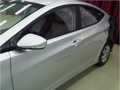
Sure looks better than the current one.
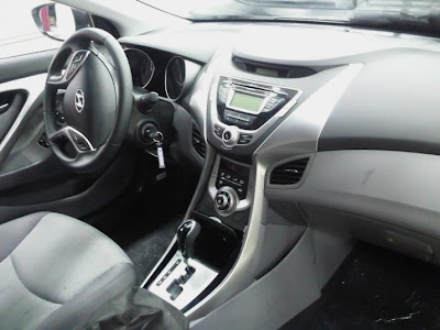
But it might also seem a bit overdone. Especially inside. We’ll see when the whole thing is visible.
It does look like a small Sonata.

Last Updated:


Sure looks better than the current one.
But it might also seem a bit overdone. Especially inside. We’ll see when the whole thing is visible.
It does look like a small Sonata.
The exterior contours remind me of the sculpting on a BMW. I agree, the interior looks like a lot going on in a small space, but looking at the Fiesta, and the Cruze interiors, it looks like the trend is the busier the better. Amazing when you look back at interiors on the econoboxes of the 70's and 80's, how cheezy they were.
Well, I'm not crazy about that Dodge Avenger "C" pillar design. Lame.
Very nice… I can't wait until Hyundai re-designs their entire lineup with "Fluidic Sculpture"
Those wheels look like lawnmower wheels!
The front end is going to make this thing look retarded.
They have to meet roll-over laws now…These designs are all going to start looking like eggs.
That contour crease along the side is much nicer than that amorphous line on the current model.
The most uninteresting car ever.
The interior design is a huge disappointment if you ask me….
Not a fan of this design, interior or exterior. Interior looks a bit like the new Ford Focus, where you get the feeling that they executed a "design statement", rather than a car interior. Also, why do they put the instruments in these deep binnacles? I like a clean, simple IP design – my favorite was the '92-'96 Toyota Camry.
This don't look better than the Forte. The Forte has a more muscular and sporty appearance this just look like a smaller sonata. It looks good though. I give Chevy 8 months to be the newest car in it's class after that. It sales will go down. Specially because that Cruze has such a small engine.
Not a nice car at all.
A "little" overdone interior? It looks like a team of 20 people worked on it, but weren't allowed to talk until 10 minutes before it was all finalized. Absolutely hiddeous.
I don't like an ugly steering wheel. They had a fine looking wheel before – not a fan of this. What is with the center stack alien head? A non-replaceable radio is a slight turn off to me. A gated shifter – um, those are out of style- did you miss the memo? NO ONE liked them, they were always a bad idea. A single nob for climate? Um, 3 nobs has been tested, and it works very well, don't mess with success there.
I'll judge the exterior when I can see more.. yuck on the inside.
"Absolutely hideous". – Anonymous
Please. You people are absolutely ridiculous. When a car comes out with an interesting design then it's called "hideous" but when it's more conventional then it's too boring. You can't knock the effort. That's why so many companies play it safe now because they're too afraid of scarring off customers. If they didn't try at all and still came out ugly then you have a point.
Car companies need to find designers with adult/manly tastes. The goofs don't have jobs anymore so twitty looking cars won't sell now.
Interior looks cheap in the pictures and in this color. Why was so much real estate devoted to awful "chromish" areas above the center vents while those vents are so tiny? The current car looks more upscale than this.
Anonymous said…
"Interior looks cheap in the pictures and in this color. Why was so much real estate devoted to awful "chromish" areas above the center vents while those vents are so tiny? The current car looks more upscale than this."
My point proven once again. People claim they want something different but really want more of the same.