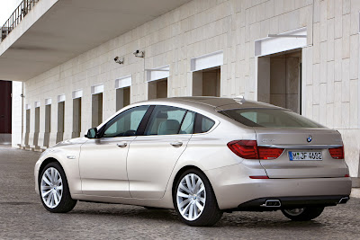
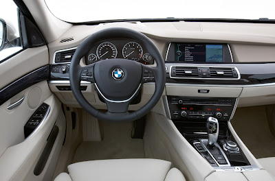
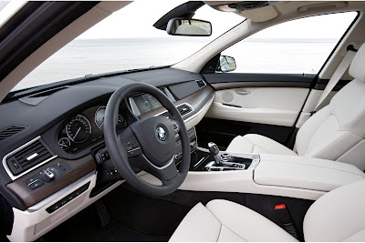
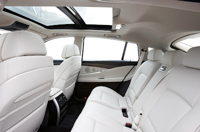
More (and bigger) pictures of the new 2010 BMW 5 series GT
Last Updated:


I like the interior design. Although there is really nothing new. It does feel modern and upscale.
And I usually do like hatchbacks.
But the way the hatch meets the lights seems just wrong and awkward…
Maybe, just like the X6, it looks better in person…
I think a lowered X6 would have looked much better.

hate it
I love the Mazda 6 hatch, the Ford Mondeo hatch etc. Usually the hatch version is the better looking one. But this is just fat and awkward and the name GT is just wrong. Totally wrong, a farce. Someone should prohibit the use of the name GT for such a type of car.
I think a lowered X6 would be a 5 series GT.
I would love to see an M5 GT.
Or for the Five Percenter women, an MGT 5. 🙂
ugly and german
BMW has really come out with some darn good-looking interiors in recent years. Mercedes and Lexus could learn a lot by studying BMW.