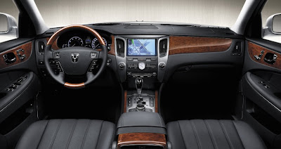
Hyundai Equus interior
Last Updated:

This time its the real thing.
It looks pretty much like anything else in this class.
With plenty of wood, in the old 1990’s Korean car tradition…
But it doesn’t look much worse . Conservative, all fashion. Just like a big Lexus.

The real thing never seems to look as good as the drawn illustration.
That gated shifter needs to go. I don’t know why companies insist on putting those in new cars. They just look dated now.
No Hyundai badge on the wheel. And the badge that is there looks great.
Yeah, it’s a stody design, but its a lot better than the crap coming out of Mercedes and the cheap junky looking mess in a Bimmer, not to mention the latest Audi dashes are unimpressive and Lexus dashes are a bore.
I could live without the wood in this and without all the buttons on the door inserts, but overall it’s a fine design and a load better than the Genesis.
Go Hyundai (gulp – I said that?)
It looks 100% better than the real tame/frumpy genisis dash !
Somehow, it has too much wood paneling, to the point that it looks gaudy. Less is more Hyundai.
If this was a Mercedes, Cadillac or even a Taurus Accord or Malibu this would be pissed on by everyone. Hyundai benefits from low expectations and lots of marketing hype. The reality is that a five year old Buick looks better than this poor copy of ten other cars.
If the genesis had this kind of interior, i would have bought one the day it came out.
This interior is at least equal to infiniti/lexus interiors and WAYYYYYYYY better than bmw/mercedes.
This is nice..Nothing wrong with it.
Except for the big nav screen, this could be from 1990