Nissan 370 Z
Last Updated:


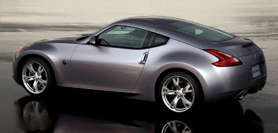
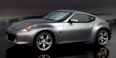
These are the first official pictures of the all new Nissan sports car.
Even though the design isn’t as pure as the current generation, it still looks great.
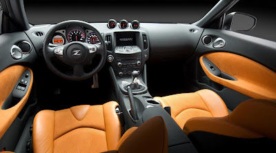
And the interior, just like the one in the new Maxima, could very well be from an Inifiniti.
We’ll know, and see, more later.
I just hope they offer more choices as far as interior colors go. Black, or black and orange is just not enough…

Nice modern 1975 retro style for 2009, add a V8 and all you’ll see from your Camaro, Challanger, and Mustang are the taillights.
An instant classic!!!
No thanks. I hate Nissans design language and this new 370Z looks like a car from the movie “Cars”. Too cartoonish and childish.
I think it is stupid that Nissan/Infiniti have the same dash layout. There isn’t anything to differentiate between the luxury line and a normal Nissan.
It has a slight 70s retro look about it. Not too shabby at all.
oh my, i thought i was looking at a porsche there … which is a complement to nissan design team.
Reminds me of my uncles 76 Vette in that rear shot. Nicely done, not too much retro, just enough modern. God to see curves in this post modern jellybean era of auto design.
I like it.
Front lip sits way too high. Ruins the flow of the whole car.
That is one good looking car!
Looks better from these angles, however I’m seeing a little bit of Crossfire in the rump.
The interior’s nice. The exterior I can take or leave. Where the A pillar meets the roof looks terrible.
Anybody else hate those new Nissan front and rear light “curly-cues”?
Svete, avante garde, slick, la giocefu, love the light treatment front and rear. muscular, taught, steely, chiselled, tensile strong…..this is Nissan, this is the future, Toyota and Honda aren’t even in the same category….it’s no contest, TKO!