More Acura TL pictures
Last Updated:
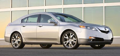
It’s just way too overdone.
Everywhere. Inside and out.
A generic shape covered by weird details and overly sculpted surfaces everywhere you look.
Pretty vulgar looking if you ask me.

Last Updated:


It’s just way too overdone.
Everywhere. Inside and out.
A generic shape covered by weird details and overly sculpted surfaces everywhere you look.
Pretty vulgar looking if you ask me.
Exterior…hideous
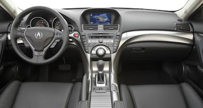
Interior….too busy looking and hideous.
Who the heck designed this thing, an ex Aztec designer?
I’d rather be poked in the eye than look at this thing.
I think Acura and Honda have the best design inside and out. maybe the outside is bit overdone. inside is THE most nicest of all….killed BM, BMW, and Lexus. don’t want to talk about GM or Ford.
Vince, well said, agree /w your comments 100%.
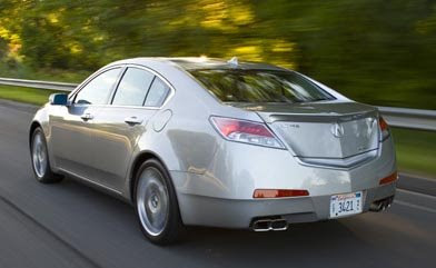
The rear 3/4 shot looks like a Maxima on Acid! I really think Honda ruined this car.
My God is that disgusting.
A direct side profile is likely okay and nicely simplistic, but then you move to the front and the back and they are horribly unspimplistic, but the problem is they actually also do not match each other. It’s so disjointed.
And then the dash … a billion buttons, a variety of curves that don’t go together, and the dash sides do not integrate well into the door panels from what I see.
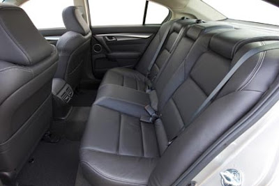
On the bright side, the back seet looks good, and the sterring wheel looks nice and thick and grippy.
As disgusted as I am, I’ll still reserve judgement till I see it. But the track record is not good. The new TSX looks like hell in the flesh, the RDX and MDX are atrocious, and the Accord is an abortion.
Holy cow this thing is hideous. The first picture where it shows the side view, the wheel area is REALLY bad. The panel bulges out there but then the bumper panel is like on top of the wheel. WTF!!!
RIP NEW TL. The old TL looks way better.
The Old TL was a god looking car with a great interior.
Vulgar is exactly the word that came to my mind. This may be the ugliest car in decades.
Well… the back seat looks nice. That’s about all I can say.
If a car company was ever capable of having an abortion…
(I do like the interior, tho.)
I could tolerate the inside and front and sides but…
The rear killed it for me. Acura and Honda must have hired a retired GM designer.
Wow! This is awful. I think Geely can design a better looking car than this. It is unfortunate too. Acura makes nice, quality cars. People don’t buy them for their stunning design, they buy them as reasonably priced, reliable and luxurious transportation. If this car makes a statement about its owner I think the statement can be summed up with one word: garish.
I predict a redesign in 2 years.
So well said Vince! What a shame that Acura invested so much in a car which is clearly not as attractive as the current model…at least in these photos.
Just when we thought they couldn’t make the Accord look worse….they found a way.
I’m sorry, but this looks more like an Accord now than the 1998-2002 era.
The interior don’t bother me that much but the exterior…old Maxima + GS + Aura (rear) and take a case of Viagra???
Both from and back bumper should cost a lot to replace after accident since it cover so much area!
I like it! It’s something special! In real life it will be total different that on those pictures! Just like TSX.
What an abomination.
I to like it. Got the Accord 08 for the Interior and exterior appearance. Don’t care about others not liking it.
It could be saved! Get rid of the fat lipped front end, eliminate the mazda wheel flare over the front end, kill the spoiler, lower the back lights and make them bigger so it doesn’t look like it has a huge a$$. The interior, well I just don’t know what to say, the new shifter is definite improvement over my 08 TL.
Funny car, looks like a “transformer” car.
Anonymous 7:06pm
” and the dash sides do not integrate well into the door panels from what I see”
Exactly what I thought looking at the interior… I do like how the silver pops against the black, as long as it’s real metal and not plastic.
BTW, I think that we can coin a new word for this car: pimpistic (not pimpastic), as opposed to simplistic
;-)_
sorry, I meant pimplistic!
i remember how much i liked honda designs from the late 80’s and early 90’s. now i feel old. honda make some of the cleverest and best made cars in the world, but now only seem capable of over or under-doing the styling of most of their cars. the euro-civic has a neat shape, some odd details, so maybe counts as an exception.
Yikes. What’s going on with Honda/Acura design lately? First the new Accord’s over-reaching bloat, then the new Pilot, and all these Acuras designed by Gillete, apparently? It’s not just out of character, it’s hideous. It’s surprising to see such a sure-footed company make such gaudy designs.
I think the interior is OK, but the exterior is just too much. It’s got that Camry/squinty look to the head/tail lights. Not good. But in my opinion (without seeing it in person) it’s not worse than the Camry and plenty of people are dumb enought to drive around in those. Revise the bumpers and lights on both ends and it would be OK.
Hey, at least the wheel look nice.
While everyone keeps on bitching about the looks of this new TL it will still sell like crazy, just like the new TSX.
I actually really like it.
I like it. It is different than anything else on the road. Despite the Acura bashing here, deep inside, you know it is going to be a success. It looks aggressive, luxurious, and high quality. I thought the grill was funny. I am a little turned of by the tail lights now. Oh well. I will wait to see it in person. The TSX looked good in pictures, but not in person. The opposite for the new RL.
“Gillette” hahaaa
Honda Design seems to go with a big splash with a car’s intro. At mid-model change, their designs get a little more conservative. I find I usually say “what the…” at first, then it grows on me. The interior is a little much though, and dark. Yikes! But I’m glad someone is pushing the design envelope. I’d rather have that than boring Toyota’s or a 90’s look Lexus.
Hope Honda/Acura and Mazda keep going in this direction.
This latest design abomination from Honda/Acura is pure rubbish. I do agree that the brand loyalist will flock because it is a “Honda” you know.
But this car will FAIL to deliver any significant conquest sales from rival brands.
Uglification has found its own brand = A C U R A!
I hate those sculpted seats. I am 6’1 and seats like those would cause my back and shoulders to hunch forward. Bad.
it’s still a klingon battle cruiser.
and…
hyundai-kia’s idea of “luxury” = fake wood and merc/lexus design copying.
acura’s idea of “luxury” = lots of buttons
infiniti’s idea of “luxury” = obscene amount of horsepower and lots of curvy sheet metal
sigh.
i’ll go with my own idea of “luxury” = not having to use gasoline.
Silver is probably the best looking color for this car… and the photographer knew it. This chrome garden-hoe grille is like a pimple on an otherwise smart shape. The rear okay, but derivative of a Saturn/Opel. The interior is nothing newsworthy. Audi/VW, BMW, and even some new GM vehicles have better ineriors than this. The large control knob on the dash makes the console look like a cheap Fischer stereo from the 80s.
I thought the new Accord was bad. but this is worse. Far worse. uglier than an unborn aardvark. I have been driving Hondas for decades. no reason to trade in my current ride. an old Accord.
Ugly and bloated it’s a car shaped Aztek by Acura.
I own a Honda and like the car. But with the current direction they are going with their designs, it may just be the last one. If I had to sum up the cars that have been coming out lately — the Pilot, the Acuras — with one word it would be this: Fugly.
A stylist is really just a childish psychopath.
I swear that the previous TL was designed in Italy. No way could the same people have drawn this. Last TL was a fine tailored Italian suit. This is a japanese transformer.
I just spent an evening walking around an Acura dealership and made two important observations:
1. The new TSX and RL have so many ridiculous splices/curves/contour lines going every which way, it totally spoils the overall design. The TSX, when viewed from the rear quarter, has so many directional changes under harsh parking lot lighting that you would swear the rear bumper detached and was hanging off underneath the taillight! So this new TL isn’t too much of a surprise when it comes to needless detailing.
2. The current TL doesn’t look all that great either, particularly since the mid-cycle refresh. The silver-painted faux-aluminum super-plasticized grille looks like it should be on a Smart or Kia! I saw two with a ritzier chrome grille, then realized they were the Type S model, which only comes with the ugly charcoal wheels. And has anyone noticed the glossy STRIPED plastic insert around the current TL’s rear license plate? WTF is that?? Why can’t Acura match materials on any of their cars? Looks like we get both silver-painted super-plastic AND chrome on the next grille. Oh Goody.
the european accord (TSX) tourer is a beaut. But its for Europeans. I guess Honda figure it can sell their weirdo stuff to us heathen Americans. just stick Nav/bluetooth/etc/etc in and no one will notice.
Its different will it will grow on you. Quite an agressive rear end.
But americans like big and ugly cars. So honda is catering for that market.
Another Pokemon neurotic design…Freakin laughable.
Why do car companies hire stylists?
Japanese have no sense of style/class.
A ‘generic shape’ would be a step up.
Nice smiley face grille. The car is happy.
rh th japs are now designing theur cars o be the ugliset things on the road they will gio bankrunpt within a year
I like it. Should I seek counseling?
I actually really like it. I am not the biggest Honda/Acura fan but I would take this over the G35 or Lexus IS any day.
old maxima rear 3/4
el_monty said…
I like it. Should I seek counseling?
Probably. You have issues. Just look at the picture you chose to represent yourself.
I’m kidding. This Acura will appeal to someone. After all, Ford sold a few Edsels long ago, and history does repeat itself.
Beautifull inside, fugly outside.
Don’t judge a book by its cover lol!!!
It’s designed in the USA, so give those japanese anime maniacs a break…
Hahaha thats true,it’s designed in the USA.
Honda signed off on the design.
“It’s designed in the USA”
Maybe that’s the problem, it’s theme park Japanese…a caricature of an Acura.
Shame. There’s probably a great car under all that Tammy Faye spackle.
Front end looks like a smiling elephant seal:https://benveronica.files.wordpress.com/2007/11/elephant-seal-2.jpgorhttp://www.mikebrock.com/images/images/male.jpgThe rest is OK, if overdone. Could be a car that must be seen “in person.”