Even more pictures of the new Golf
Last Updated:
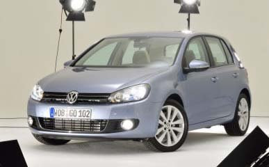
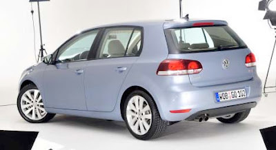
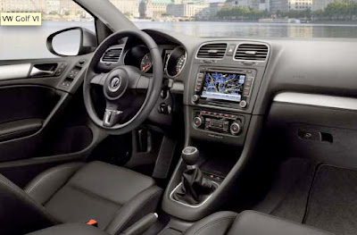
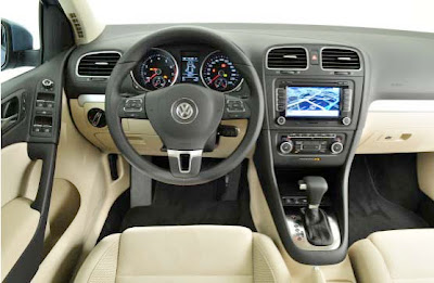
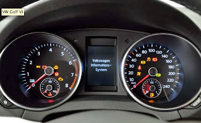
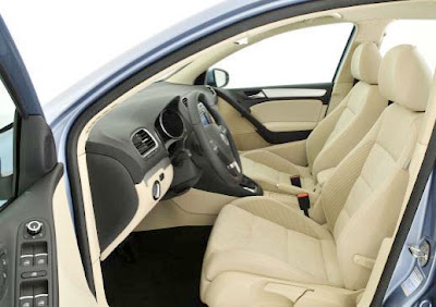
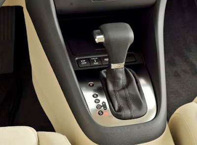
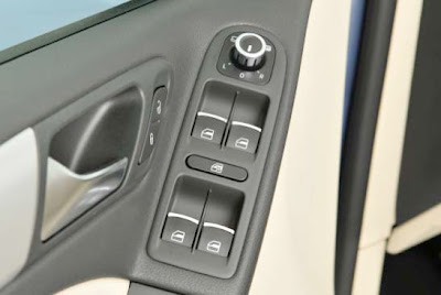
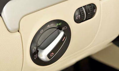
With better details.
Showing, once again, how good VW is at designing interiors that really look upscale. Not really original or very modern, but upscale looking.

Last Updated:


With better details.
Showing, once again, how good VW is at designing interiors that really look upscale. Not really original or very modern, but upscale looking.
It is very functional. It doesnt need to be overdone with bells and whistles or look like a batmobile interior like the new ford fiesta a few pictures down.
I would say this is the Golf generation that has changed the least from its predecessor. It looks OK, and it ties in aesthetically with the Scirocco, but it’s not very exciting
I agree with anonymous. I hope people will look into the greatness of this car with respect to its mpg— for their benefit. This is a great new car for the times.
Harmless, I guess the exterior is just really, well, there. This is as safe as VW gets, they need to step it up a bit in the design department. Too much competition now days to be this conservative.
What a very nice scupted box. it reminds me of so many other boxes over the past 30 years.
Wow, those gauges are ripped straight out of the Mercedes ML.
Awful.
I can see where the new Golf interior looks more upscale than, say, an Elantra or Matrix, but the upcoming Cruze interior looks way more upscale, attractive, inviting, and daring than this boring-looking VW any day.
Will you be able to control the PARKING lights in the base model?
looks like vw is going back to its roots; a far cry from the phaeton disaster just a couple years back…
will vw be able to retain buyers though, with cheap plastic mesh fronts and metal foils tacked on with double-sided tape?
would of never though the phaeton could have caused this much damage to a brand…
A Daewoo/Chevrolet with a more upmarket, higher quality interior than a Volkswagen? What have you been smoking?!
The Cruze’s interior may look considerably more racey, but you can bet your last $ that the quality of materials used won’t give Volkswagen, or many other European carmakers sleepless nights.
As for the Golf VI, the exterior is a miss, looking far too much like what it is – a reskinned Golf V. The interior’s a different matter though, as it harks back to the simple, elegant functionality and high quality of the Mk IV, rather than the overly flat, utilitarian and uninviting look of the Mk V.
Anonymous 2:25 wrote
“Harmless, I guess the exterior is just really, well, there. This is as safe as VW gets, they need to step it up a bit in the design department. Too much competition now days to be this conservative.”
No, VW is doing things spot on. VW/Audi interiors are the benchmark of the industry. My 98 A6 has an interior that still feels modern and very well done. It has aged well. Contrast that to the Civic or the Scion interiors. They are cutting edge but I don’t expect them to age well at all. Who the hell wants a two level dashboard? Who wants their display console in the middle of the dashboard? These are stupid, quirky designs for the sake of quirkiness. Give me a nice, well-laid-out, ergonomic design any day. I have to live with the interior for 10+ years and luckily don’t have some design-school, turtle-necked, Steve Jobs wannabe moaning about the interior from my back seat (tied up in my trunk maybe, but not in my back seat).
Well that is nice for the interior, but, the exterior still looks like it was designed in 1998.
booooooooring… This is what a car looks like in 2009????????
wow, groung breaking, i have never seen anything like this since the 1978 rabbit and every vw since…..YAWN!