A few more BMW 7 pictures
Last Updated:


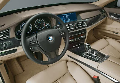
Seems that the dash isn’t as flat as before.
It’s kind of angled toward the driver a bit more. The the old BMWs used to be.

Last Updated:


Seems that the dash isn’t as flat as before.
It’s kind of angled toward the driver a bit more. The the old BMWs used to be.
Whoever made the center console flat should be fired. BMW is making ugly cars now. Freakin stylists are just goofs.
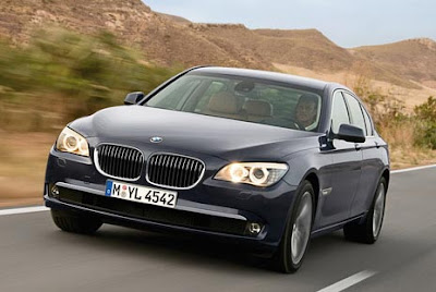
The frontend looks pretty bad. It looks way old before its time. I don’t get the gray bumper on bumper thing going on being the fog lights.
Horrible and yet boring, too. BMWs have been off my shopping list since Bangle took over.
My God, why would anyone buy this over a Hyundai Genesis.
No…Come on now, Vince…You are doing April 1 in July, aren’t you?
this car looks shit!!!!!!!
i know ppl complain about the “bangle” design but i really liked it. especially the 7 series!
The Genesis looks way better than this. And i haven’t even mentioned Infiniti, Audi or MB yet.
BMW’s are really boring and those interiors are so 1990’s.
Anyone that buys this is purely logo brain washed.
The current 7 Series is one of the un-smartest looking executive sedans on the market today. They all seem to be driven by wannabe rappers, old men with pinkie rings or guidos. While this isn’t as polarizing as the current 7’s bad design, it’s very dull. All of the competition is much better looking.