Opel Insignia/Saturn Aura
Last Updated:

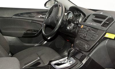
Sure it is still missing some trims on this picture.
But it does look really good already.
This should give GM another really good car to compete in the mid sized segment in the US as the next Aura.

Last Updated:

Sure it is still missing some trims on this picture.
But it does look really good already.
This should give GM another really good car to compete in the mid sized segment in the US as the next Aura.
Can’t tell quality of materials from this picture BUT the interior appears to be a huge improvement over current Aura which in my opinion isn’t up to Korean (much less Europen) interior standards. With the exception of Cadillac (new CTS) GM interiors still use poor quality materials.
The one main thing that is holding the Aura back from being a real player is the interior. When it came out, it was just keeping up with the CamCord. But as everything else improved, the Aura fell conspicuously behind. The exterior in my opinion, is one of the smartest looking designs avaialble.
it looks only OK to me. hopefully the missing trim pieces spruce it up a bit. or maybe a different color scheme. I’m still overall not too impressed with mainstream family sedan interiors (although I did like the chevron-shaped stack of the previous generation accord).
To me it is surprising interiors have not evolved quicker. BMW with I drive, Volvo with floating center, but, all in all most are still alot of button, knobs and silly old fashion gauges. Is it people just won’t accept change or manufacturers are unwilling to step out? The concept that was really cool was the Volvo XC60, how much will actual be in the production version?