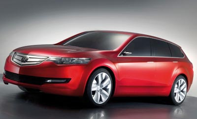
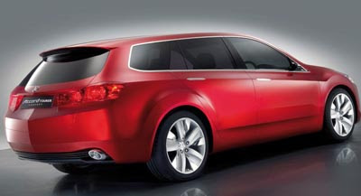
Honda Accord Tourer concept
Last Updated:


This is a close preview of the next Euro Accord design, in wagon form.
So pretty much, out next Acura TSX.
The grill actually looks like a good fit for the current Acura design theme.
But we won’t get the cool wagon….

Save for the longish schnoz and goofy Acura-style grill, the Accord Tourer is so much better looking than the ghastly Accord we’re getting.
Once again, instead of North America getting something practical and efficient we are stuck with useless gas guzzling SUV’s like the Pilot and MDX or better still the ugly CR-V.
“longish schnoz”? It is a front engine front wheel drive car with the new pedestrian+offset crash regs. That’s how things pretty much have to be, it’s not a styling decision. The days of the low hood are gone too because of pedestrian hood deflection requirements- that’s one reason the Accord and its competitors are getting so loafy in front. The Accord tourer probably doesn’t have to package around a V6, so it can be a little more compact.
“Once again, instead of North America getting something practical and efficient we are stuck with useless gas guzzling SUV’s like the Pilot and MDX or better still the ugly CR-V.”
Since when have the Pilot and CR-V been gas guzzlers? Ignorant comment. There is almost no market for a vehicle like this in the US. See how well the Mazda6 wagon did here?
“longish schnoz”? It is a front engine front wheel drive car with the new pedestrian+offset crash regs. That’s how things pretty much have to be, it’s not a styling decision. The days of the low hood are gone too because of pedestrian hood deflection requirements- that’s one reason the Accord and its competitors are getting so loafy in front.”
You are absolutely correct, sir. This is why the CR-V has such a unique front end, people don’t understand this.
MR.
Is Honda adopting the “same sausage, different length” design language? Like their SUVs, the back looks like an Audi Q7 and the front looks like a garden hoe. While this is the best interpretation of this design theme, it probably won’t translate as nicely into production.