More pictures of the new A4
Last Updated:
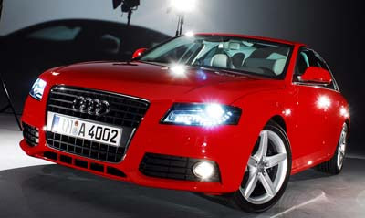
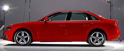
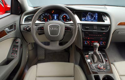
The interior is a huge improvement over the current model.
But outside…
Is it really that much better?

Last Updated:


The interior is a huge improvement over the current model.
But outside…
Is it really that much better?
The interior may be an upgrade in soft plastics and fit/finish, but the busy layout is not doing it for me. The current model is much more simpler inside.
I agree with Carl. I’ve owned 2 A4s and always liked the simple, clean dash. I’m sure there are alot of great new features on this model-but it looks busy.
Agreed Vince. I can hardly tell the difference between these exterior photos and the current model.
The outside changed? The inside on the other hand must be trying to set a new button record!!!
Whenever I have insomnia, I just look for pics of this car. Puts me right to sleep. Yawn. Time for a nap.
true, the styling is almost unchanged. but that’s ok, as Audi seems to have perfected their A4 style. What *has* changed is the proportions of the vehicle, in particular a shortened front overhang and long axle-to-dash ratio. Much sportier, much sexier.
good work, Vince 😉
My thoughts are exactly the opposite. I like the clean design of the exterior, but the current interior is a step down from the current model. The perfect A4 was the 93-96 model. I could do without the non-functional size of the screaming grill. Wish Audi would move on to another design there. But, otherwise, nice job on the exterior. Meh, on the cluttered interior.