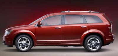
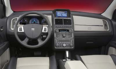
More Journey pictures
Last Updated:


I have to say, the interior does look much better on this picture.
At least this seems a much nicer car than the Escape.
For those who dont like curves…

Last Updated:


I have to say, the interior does look much better on this picture.
At least this seems a much nicer car than the Escape.
For those who dont like curves…
This is a nice looking wagon and a better, slightly more economical choice for insecure people who think they actually need an SUV when a Caliber would suffice.
I don’t like the hood over the instruments. It looks too square, kinda like it came from a K car or something. The center stack looks to big or wide for the dash. The dash is just real odd looking. The exterior is’nt bad looking though. Is this supposed to be Dodges answer to the Edge or something?
JM
The exterior styling of the Journey is nice in a conservative sort of way (and yes, nothing overly exciting), but certainly no uglier than the over-styled for styling sake vehicles we see coming out of Nissan for instance. The interior is actually quite attractive. It’s just a little too bland-looking colorwise. A little wood trim would help.
I hope they don’t use an old Journey song for the commercials.
This could be in the same class as the Outlander, Equinox, Torrent, Grand Vitara and maybe the RAV4.
Its pretty nice in the red, I have to agree the dash seems out a bit odd, but not ugly.
Yawn. All Chrysler products are looking the same. Same roof line, Same front end. The dashboard is more plastic crap. It is understood that these cars coming out now are still pipeline cars from the “old” company. I hope that they get down to redesigning the cars to make them really competive. I used to by Chryslers way back when.