2008 Honda Fit
Last Updated:


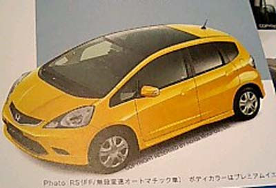
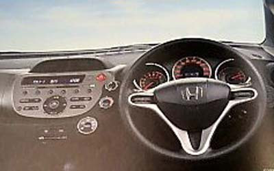
Distorted pictures from a Japanese magazine.
To me, it just looks like a re-do of the current design. Nothing really new.
I like the glass roof. And I’m sure it’ll be a very good car.
I was just hopping for something more original.
I guess I forgot it was still a Honda.

Wow, that interior looks worse than the current Fit.
Honda really needs to ditch those ugly steering wheels. Better yet, find some new designers.
And the (s)hits keep coming!
Yes it’s still a Honda, which means evolutionary redesign, even though the Civc and Accord were somewhat radical departures from the previous versions. I do like the interior, but I wish they would offer a K20 option to make it a true pocket rocket like the CRX was.
The Japanese have no sense of style.
Anonymous said…
The Japanese have no sense of style.
3:14 PM
Bullsh*t. Some of the world’s beautiful architectural, landscape, and industrial designs are from Japan. Since we’re specifically talking cars here, just look at the 2000 GT to learn just one good lesson in Japanese sense of automotive style.
And again they use the ugly steering wheel from the Civic & new Accord!