More Peugeot 308 pictures
Last Updated:
Sure it does look like other Peugeots, but it does look much better than what we get over here.
Mainly the Mazda3 or even the Jetta.
The Mazda3 is fine, but this does look more modern. Especially inside.
Maybe they could bring it over as a Mitsubishi? Just like what they might do with the 407?
Who knows…

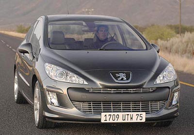
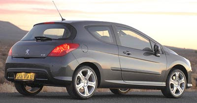
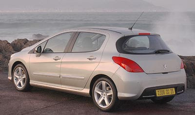
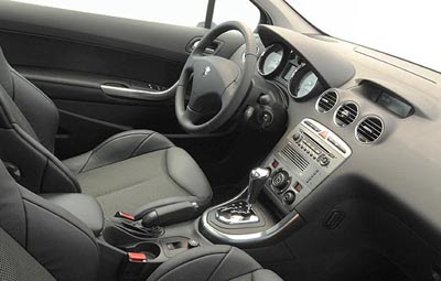
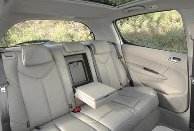
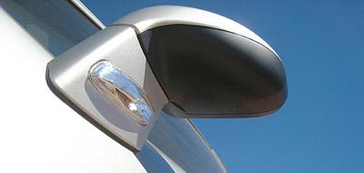
Damn, that is one fugly car! Nice interior, though.
Jeez, could they have made the logo on the nose any bigger?
The nose is sooo ugly and the rear is just too plain. It’s like the designers used all the pencils for making as many edges on the front leaving the rear to be designed with a crayon.
I do believe this is the first car with braces.
Damn, that’s one hideous front end.
LSD is apparently one hell of a drug.
Vince,
I see a trend… French cars are always modern and look better than American or Japanese cars…, so why are French cars not that popular in Japan and non-existant in the U.S.?
Because they are down right ugly is my opinion. I see “big car” lines and design cues stuck on a small car. Every line, lump, and grille hole (including the logo) is way too big on this little people mover.
I hope this car will be a failure so that Peugeot will learn a lesson for making a design so ugly and derivative. It’s time for them to make changes in their exterior styling team. They can keep the interior people, though.
Vince, this car was shown at the Frankfurt auto show in 2003. I have some pictures of this show if you want them. It looks a lot better in person.
🙂