2008 Highlander
Last Updated:
More pictures.
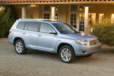
it sure does look more upscale.
And I guess the design doesn’t really matter that much for most family car buyers.
It is after all, the Camry of SUVs, and sells more on reputation than looks.

Last Updated:


More pictures.
it sure does look more upscale.
And I guess the design doesn’t really matter that much for most family car buyers.
It is after all, the Camry of SUVs, and sells more on reputation than looks.
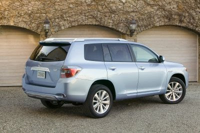
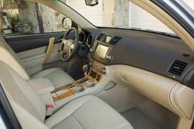
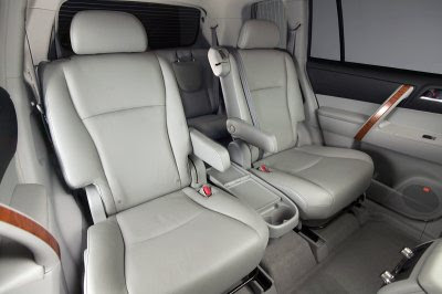
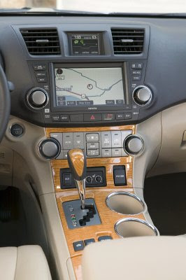
The interior is nice – save for the overly phony plood. And is that, tape on the door handles? – but it won’t save the homely exterior. And with the quality of most new vehicles being so close, styling will be more of a purchasing criteria.
Looks Korean to me. I’ll wait to see new Pilot. Ugh!!
yikes, that exterior is hideous! especially the front end
the interior’s pretty nice though. it looks really high quality.
what’s with toyota ballooning all their suvs? first the rav4 and now the highlander are way too big for their segments.
Looks like a larger RAV4….
The interior looks nice, but its just boring overall. I’m not impressed, but I’m also not a soccer mom.
Who thought the “cereal bowl” side design was a good idea? Childish design.
Why not make the shift stick a little taller….
it seems that most car makerts are going with evolutionary rather than revolutionary. in regards to the new highlander, the interior is a huge improvement over the outgoing model. very handsome and looks very ergonomic also. the exterior on the other hand could have been way better. i seems as though they took the basic shape and lines of the rav 4 and added a few more bumps and bulges to area’s that they though would be appropriate. it’ll be a strong seller anyways.
Some how it managed to look more modern than GM’s offerings. But still, I will rather take the Buick Enclave simply by the amount of wood and leather they used. Toyota’s look too stingy on that.
It looks like a Tundra…Hey…Wait…It actually does.
With sub-par designs coming from most manufacturers, we should praise designs from manufacturers that are actually doing something different.
Companies like Nissan, Mazda, Hyundai and GM lately (never thought I’d mention GM in this light) are taking more risks with design and for the most part for the better.
People criticized the Nissan Rogue, Hyundai Santa Fe etc. but you put those against designs like this and goes to show just how amazing they look. Especially since Toyota has so much more resources than the others. I truly admire companies like Nissan and Hyundai.
does anyone else a pure copy of a subaru in the front and the cx-7 in the back? jeesh, i thought toyota was creative. Wrong.
Toyota’s conservative ways it’s both it’s strength and it’s weakness. After all this time since the last redo, and Toyota’s vast resources and abilities, it’s a big shocker that they would hatch such an ugly duck. I would have expected something like this from Ford, not Toyota.
Now the Mazda CX-9, the Hyundai Sante Fe or new Veracruz or whatever it’s called, the next Pilot and even the new Saturn 7 seater all would be on my list ahead of this car just based on looks alone. Yes, I want reliability, but I also want to be like looking at it for my $45k Canadian.
On a positive note, I’m sure it will be a hit with the over 65 crowd in Florida. And the die hard Toyota fans – the I just want it to work buyers.
Toyota could make the ugliest cars in the world and people will still buy them. Most people value reliability over pretty design. Toyota is trying to prove this theory obviously.
Who would be proud to own this? Or any Toyota for that matter.
(with the exception of the last Supra and 2nd gen MR2 of course)
Nice evolution of a boring crossover. All sides of it look good except the front. It will be a hit anyway, since most of the buyers do not look at their cars as an extension of their wardrobe. A friend of mine loves his Highlander, but he is not the type who corners his cars at 100 mph every 5 minutes….like the rest of us…..
Looks like Toyota is following in GM’s cheap footsteps by Making the edge of the rear door part of the wheelwell. In the winter months snow, salt and ice build up in the space between the two, feezing the rear doors shut and corroding the edge of the doors! Nice Touch there Toyota! What other shortcuts have been taken?
Hey Vince, Isn’t this a picture of the new 2008 Kia Sorento, a corporate version of the 2007 Hyundai Santa Fe?
looks like the result of a high speed collission between a mitsubishi suv and a subaru forester. the highlander has a bad sludge reputation, this won’t help!
“…the rear door part of the wheelwell. In the winter months snow, salt and ice build up in the space between the two, feezing the rear doors shut and corroding the edge of the doors! Nice Touch there Toyota! What other shortcuts have been taken?”
Toyota trucks are notorious for rusting at the wheel wells. Maybe since the door will be covering this, it will hide the problem a little while longer.
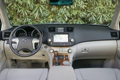
This interior is the perfect example of the “everyinterior.” Asian, European, and increasingly even US makers have developed a stunning degree of design uniformity regarding interiors. Look at the above photo:
– Two tone upper and lower dash (one of which must creme-colored): check
– Wide center console with nav unit on top: check
– Chrome or wood detailed “luxury car” style gear shift: check
– Center stack of buttons flanked by big knobs at the ends: check
– “Tunnel” like gauges: check
– Fake wood, aluminum, or carbon fiber accents (perhaps multiple ones): check
– Steering wheel controls: check
There is almost no individual or national brand character in interior design. You could slap a Mercedes, Lexus, Toyota, Subaru, Kia, Hyundai, Acura, or Saturn logo on the steering wheel in that photo, and I could believe it.
The Ford and Chrysler are different, but only because their design and materials are so far behind that they stand out.
BMW and Audi, for their ergonomic and stylist faults, get some credit for at least attempting to be somewhat different.
Nissan too has an individual style, although I can’t say I love their flat fake metal buttons on flat fake metal surrounds motif that reminds me of a 1986 Nissan Stanza.
US makers seem to be all over the map, somewhere between aping the international consensus above and trying some unique elements here and there, with variable levels of success.
I find it really depressing. Which brand is willing to be the 21st century version of the Isuzu Impulse and be brave with interior design?