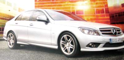
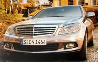
New C class pictures from the brochure
Last Updated:


Weird how they seem to have designed 2 different front ends.
The simpler one reminds me of the new CL coupe.
Sorry about the poor quality, but hey.
It’s better than nothing, right?

Last Updated:


Weird how they seem to have designed 2 different front ends.
The simpler one reminds me of the new CL coupe.
Sorry about the poor quality, but hey.
It’s better than nothing, right?
doesn’t look right
i thought only the coupes have the mercedes arrow on the grille and the sedans have the one that’s flying.
Both inside and out, this car looks so much better
compared to the current model. I hated those mickey mouse shaped air vents and the cheap looking head rests. Come on, it is a German car!
Now the need to dump the ugly duckling R class
as well at the weird CLS and maybe they can make a BMW comeback.
thanks for the pics vince!
the top picture looks pretty unflattering – kind of pug-faced like an SUV. i like the second picture where it resembles a baby s-class. i think the only difference between the two models is the grille. maybe two different markets? different engine/trim level?
the interior is ok. it needs a bit less black plastic but it’s nice. the steering well is over styled and looks weird!
me again. the top pic has the newer grille style that incorporates the star (more like the pre-1996-E-class) grilles. and the bottom pic has the more recent pointed star on the hood.
I guess the cleaner, simpler front end reminiscent of the new CL will be used to denote more sporting models in the range like AMG’s, while the standard, almost clichéd Mercedes-Benz grille will be used on the more luxury/comfort oriented models.
Looks good, a bit more upscale than the current “jelly mould” look and considerably less “challenging” than the S-Class turned out to be.
I remember reading somewhere that the c-class would have a sportier variation and a standard, more luxo-tuned variation.
that would be a good explination for the two different front ends. The one that resembles the CL would most likely be the sport model, which would explain the aggressive wheels.
that interior isn’t bad, except that stering wheel….which is ugly fugly.
It might be too soon to say, but i’m going to anyway…that interior is stupid…way too many buttons, and doesn’t flow well at all…I bet there will be more who have that same opinion…exterior is nice though
If you remove that logo from the front, its a very unimpressive car. Once that badge is there though, all the followers realize what an amazing design it is, and how much better it is than everything else. -G
I must say, this new C isn’t an improvement.
About the quality of these pics, there were from a brochure.
they look great, a huge step up from the current low rent C.
The middle one looks to be the C63 or a Sport pckg, maybe it will give the 335 a run for the money?
This thing’s supposed to compete with the likes of BMW 3 series and Infiniti G35’s?
I don’t think so. This looks like it was released back in 1993. I’ll admit the interior dash area is not bad but certainly not equal to the competition.
There may be people out there that will buy this just because of the 3 star badge on the front, but they certainly will not will over customers from the competition.
I haven’t even mentioned MB’s less than stellar reliability ratings.
Thanks for sharing the pics Vince.
This actually kind of just looks ugly. A Camry looks more expensive and elegant.
If this is any indication, the C-class will always be what it is now…and underachiever in a class of heavyweights.
The first thing that jumps out at you is the enormous three-pointed star emblem that dominates the front grille on the Avant Garde and AMG Sport Package models. A trim called Elegance will apparently make do with a standard Mercedes grille. And here is the Ass of the car which is way too small…..
these are obviously fake pictures. can’t you people see the front s don’t match from one picture to another.
and second the real think will l look much worse
when you can get a true american icon like the cadillac cts why would you pick this crap instead thes eshould stay in germany where they belong
True American icon ?? CTS ?? the original CTS (Catera) was a German car !! lol Cadillac will never have the same engineering that goes into a Mercedes or BMW. Mercedes and BMW cars are “over” engineered while GM cars are “under” engineered.
As an Icon of understated elegance, the Mercedes Benz has always held this reputation. I have driven many. My favorite is the CL coupe. I could afford one but I would have to sell my home. I don’t believe a Camry? looks more expensive and elegant than the Mercedes. It is with dismay that Consumer Reports puts Mercedes in the least dependable category across the board. I feel the quality of Mercedes has dropped miserably ever since Chrysler was added. I’ll stick with my Accord.
Mercedes quality didn’t drop after Chrysler was added, it was bad since the 1980s when electronics were added, then continued its shameful decrease until today. People are still running on the reputation from the 1970s and early 1980s that Mercedes was of good quality. -G
With MB the more things change the more they stay the same. It gives me the impression that it’s been stuck with the same look for at least a decade. When it comes to German manufacturers, I think Audi has the best looking cars on the road. Too bad all of them are trouble free for only 50,000.