Auto show#1. Tale of 2 Sebrings
Last Updated:


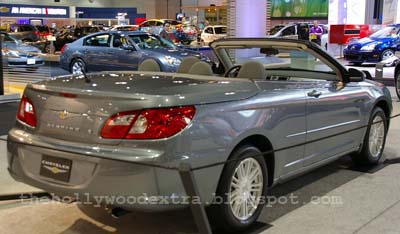
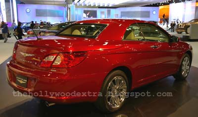
Well, I saw the new Sebring in person today.
2 of them were there, a “base” Touring model and a loaded Limited.
The Touring had the horrible grey cloth interior Chrysler has used in many of their cars lately.
And it is as awful as in the other cars.
The cloth, the grey, the whole thing looks very cheap indeed.
But the Limited had the cream leather and it does improve a lot. Hard to explain. I guess this particular interior design looks much better in a cream color. And with leather.
The back window is very small with a big blind spot.
Something a hardtop convertible shouldn’t have.
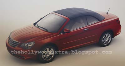
As you can see, I got a picture of the soft top version. From a picture. The actual car wasn’t there.
But it almost looks better than the hardtop…

Vince:
I like the upscale Sebring(sedan), but it is past 20K….and for now, that’s my limit( well, when you’re a contractor…. there’s Always a risk of you being let go with a very short notice. Could work at the place for 10 years, or 10 weeks. Who knows? So, I try to have a lower price level).
The base, if it had a better color scheme, something, it would be more tolerable than grey.
Anyhow…..
vince,
this looks like a 8 year old toyota avalon… with way to much front & rear overhang.
DCX is going downhill fast sytlewise….. sad too..
N.
All car interiors look bad in grey, but the poor design of the interior makes it look even cheaper in the Sebring.
This car isn’t Monte Carlo ugly, but it’s in the same league.
Last week I sat in the Sebring sedan version at the San Francisco Auto show.
It was painted a boring silver color with a light grey interior with mid-grey dashboard.
The interior shapes/details are quite nice. Unfortunately, Sebring’s bland material textures and the light grey color really cheapen the interior look!
(Think Rubbermaid almost)
Sebrings should only have dark or rich warm colors inside, with chromed dash vents.
Now here is the Really Sad Part
I walked up to the NEW Sebring and examined it for a half hour- there were no crowds at all! Interestingly the older generation 300 sedans at the San Francisco Auto show had crowds about 3-4 people deep!
Chrysler should make the new Sebrings look just like the 2000 Nassau concept car —
a mini 300 with 4 door coupe proportions!
When will these people ever learn?!
“The back window is very small with a big blind spot.
Something a hardtop convertible shouldn’t have.”
Not for nothing, but the back window on a lot of hardtop convertibles is small. So I guess they all screwed it up.
The back is very Avalon
Vince.. good job snapping the pic of the fabric/vinyl Sebring convertible off of a vertical sign without any flash shine! Sure, the styling is bland, but my biggest concern is the rear seating area in the hardtop convertible.. it looks a lot less capacious than the previous fabric model. I wonder why the new fabric version has that huge cutline for the hardtop to disappear into? Wonder how the fabric top will stow, and if the lack of hardtop mechanism will free up more rear seat space? That is why people rent these.. to seat 4 old geezers!
It’s not a bad looking car at all, especially in the soft top. Personally I don’t get the hardtop convertible craze. One more piece of complicated gadgetry to break.