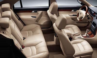
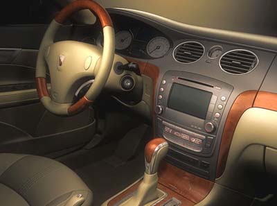
More Roewe Pics.
Last Updated:


Just to make things clear, the Rover 75 was never “based on the previous BMW 5 series” like someone pentioned here.
I think it looks OK.
Not worse than many other sedans. But the stupid name would kill any dream of selling the car in Europe.

I think the Chinese company improved the dash and door panels over the former Rover. The older car had a sort of Jaguar-wannabe look to it’s design.
The headlamp and bumper that seams-up to the front fender is a poor design. The front molded section is overdesigned and doesn’t look like it belongs on this car.
1) After looking “head-on” at the grille, is is too large. If it were “normal” sized, it’d be ok.
2) The (Tilting) headrests are at least 1 generation behind a lot of automakers. Even the Kia 2006.5 Optima has Sliding headrests, Not Tilting, like their last generation Optima had.
The interior is tolerable, overall, and the exterior is not horrible(that honor goes to the Sebring).
The name should be alittle different, although, in some places, no one will care too much, if the price is right, and it’s a decent vehicle, they’ll consider it despite the odd name.
Well it is not that bad to me, i think it is one of the best looking cars on the road, esp if it has a nice price tag, it well sell in the hundred of thousands if the price is right.
The Rover 75 when it was first released WAS based on the Previous 5 series BMW, which is now 2 models previous to what’s currently out.
Strange that it was converted to front wheel drive, then when MG added V8’s it was converted back to RWD
I concure with the top comment, I’m not surprised that they would update the rover…I am just surprised how well they did it Never would have expected a chinese car company to refine (what was already a plasticly and somewhat rough looking) car into something that looks alot newer and sleeker with such light touches.
Lets hope that it looks as remotely “better” in real life. Not that I’ll ever see one in person.
I don’t know why people hate on this car so much, it looks great. Im sure if it said “Jaguar” or “BMW” most of the people in here would say how great it looks. This car is not revolutionary, but it is definitely good.
The new Roewe logo looks good, considering the Chinese’ lack of good computer graphics skills. It’s not like a copycat of the Rover logo but is pretty original if you look at it. But the name…it could stand being a little less similar.
Regarding the car, the dash and door panels are much improved in the Chinese version. I agree with Anonymous in that the Rover version looked like a cheap Jaguar-wannabe.
The car itself looks good. Better than most otehr Chinese cars out there, even if it was derived from a Euro car.
Anonymous said…
The headlamp and bumper that seams-up to the front fender is a poor design.
I totally agree. It isn’t very visible in the head on shot, but that “S” shaped seam is clumsy looking. Not sure if I like the Audi-esque grill yet. Might grow on me.