2021 Toyota Camry: “Why don’t we ruin the dashboard for 2021?”
Last Updated:
While the Camry, like any other sedan, isn’t selling as well as it used to, it is still a very popular car for Toyota. As they still sold over 336 000 of them last year alone.
And, after a few years, it is now time for that “mid-cycle facelift”.
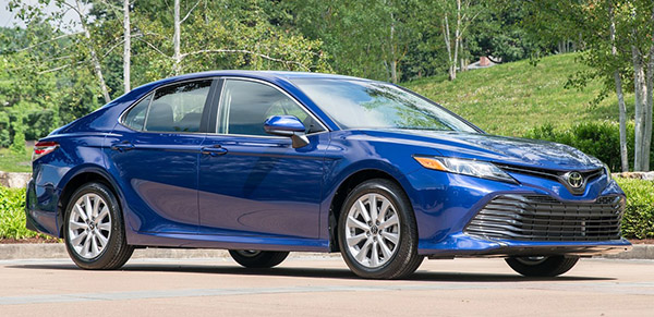
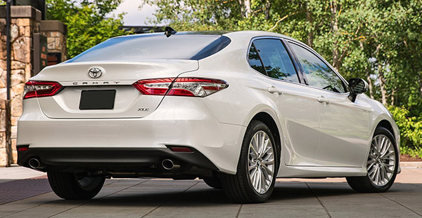
As you can see, just a few things have been slightly revised upfront. And the rear lights. the mostly fake grille is still as huge as ever. Now with chrome trim on each side, it appears even larger.
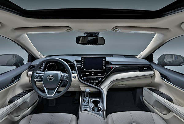
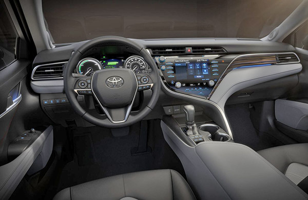
Inside, the addition of a stupid tablet screen ruins an otherwise clean interior. The whole thing worked very nicely before.
Now it looks like someone got a cheap tablet from Pep Boys, some ducktape, and just stuck it on there. They even had to reposition the air vents to make room for the thing.
There was still room to make the screen larger in the current set up, by the way. And keep a very clean design. And probably even save money while doing it.
Engines are the same. etc…
I guess I would advise people who are interested in a Camry to get a good deal on a 2020 model.


It was either a bunch of people in the focus groups going "well Audi has a touchscreen that sticks up. How come Toyota doesn't?" or the designers had literally no inspiration so they just slapped something together.
they keep the hole of the old vents, horrible.
I like the tablet, I hate the grille.
Front big frond end big and hideous!
I mean, they DEFINITELY saved money with what they ended up doing: notice how they didn't even bother to update the upper dash – the cutouts where the air vents used to be are still there on either side of the new tablet screen.
I actually feel the tablet improves the look, despite the fact it obviously was done on the cheap as evidenced by the cut outs. The previous version looked too "busy" to my eyes.
I'm so tired of those tacky Buttons all over the screen. They use it in every car they make. They look like they are all from 2000. Looks So Cheap. Let's add chrome accents to each button, to make it look even more tacky.
LOL the vent holes are still there. This is like when they updated Camry in 2016 but didn't want to change the actual side glass, so they added a big black plastic to the make the side windows look different. So cheesy.
There could have been glare issues with the in-dash screen.
I'm not sure if it's safer having it closer to the driver's line of sight, since that might encourage fiddling with it.
I almost wish the DoT would increase bumper standards to rid us of these gaping black maws.
Jesus Christ hangin' off the f'en cross….
Toyota could sell a lot more Camrys and Avalons if the front ends (huge grills) weren't ugly as hell! Ditto with Lexus.
This trend of free-standing tablet screens needs to go the way of tailfins. It always looks like a tacky after-market toy that someone bought from Pep Boys and superglued to their dashboard. Further, the trend of functionalities on a touch screen -such as heated steering wheel and HVAC controls is simply stupid. Any function that requires moving your line of vision away from the road is moronic. The function of the driver is to DRIVE not fiddle with the PLAYSTATION.
I didn't like orginal version and i like this new one even less. Toyta has the weirdest interiors. random shapes just thrown in wherever they fit…or dont fit