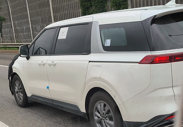
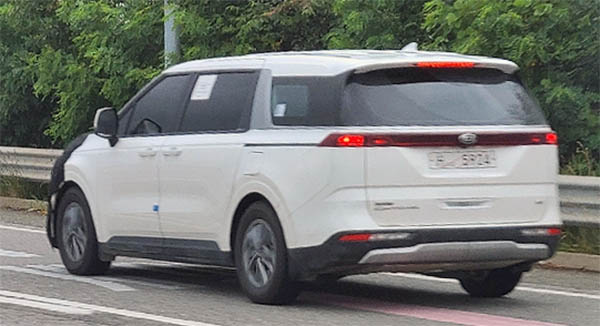
2021 Kia Sedona strange C-pillar. Up close
Last Updated:
It seems Kia has been designing strange chrome triangular shapes into the C-pillar all of their recent designs.
Including the new Sorento and upcoming K7.
I think it actually looks quite interesting in the new Sedona minivan. Since it is linked to a wraparound chrome trim, it seems well integrated. I do like the look of these smaller rea side windows too.
What do you think?


Those smaller rear side windows are going to mean TERRIBLE visibility for passengers stuck in the third row. As if they weren't claustrophobic enough.
But, yes, I'm a fan of the c-pillar treatment.
I despise all of this. It's a mess.
Can we talk about how tiny that rear side window actually is in relation to the blacked out portion of the glass?
That wrapped around chrome makes the rear graphics look dense and tense..very interesting effect.
this is crap these guys a only know o h how to make crap over there
That rear window should be re-labeled a "porthole:
I guess it's an improvement over the bland-tastic current generation, but it's nothing earth-shattering. Kia designs have been pretty uninspired for a while now. What happened to Peter Schreyer? Did he die and nobody told the press about it?
I thought it looked ok in Kia's released illustration, but now I am not so sure. The wrap around chrome is a unique touch, but I am not so sure it works as good here as it does in the new K5. That rear 1/4 window is way too small, but definitely gives it more of an SUV look. I will reserve final judgement for when I actually see it. Not getting my hopes up though.
Is the purpose to distract attention away from the huge gash in the body for the door slide?
If I were in the market for one of these, I'd look into getting that tacky chrome powder coated black. Same thing for the SUV's chrome window trim.
don't mind the chrome, it's trying to make the side of the vehicle more interesting and draw the eye away from the door rail that's not intergated into the window surround…
The SMALL rear window will be claustrophobic for the 3rd row passengers AND create a blind spot for the driver.. what's the point of the small actual window vs the blacked out glass??? The same goes for the REAR window… huge portions of it appear to be blacked out
another "interesting" design feature is the fuel door.. seems extremely poorly placed with its bottom edge part of the actual fender curve indent.. WHY?? just move it higher by 1-2cm and you wouldn't need to have a complex curve on the door OR the fender
And as I mentioned in a previous post, I'm not a fan of the rear turn signals being mounted way below in the bumper while the tail and brake lights are at "eye level"… seems suboptimal
@anonymous at 2:42 – In November 2018 Schreyer was replaced by Luc Donckerwolke as the chief design officer at Hyundai-Kia; his title was updated to "President of design management for Hyundai Motor Group", responsible for the group's long-term design vision.