2021 Toyota Sienna
Last Updated:
I have to say, I am quite disappointed. After all these years.
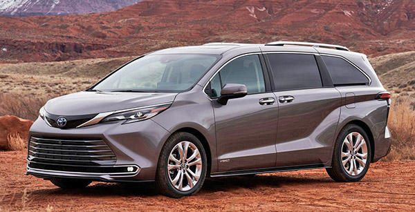
As far as the design is concerned, there is just way too much going on.
What a mess.
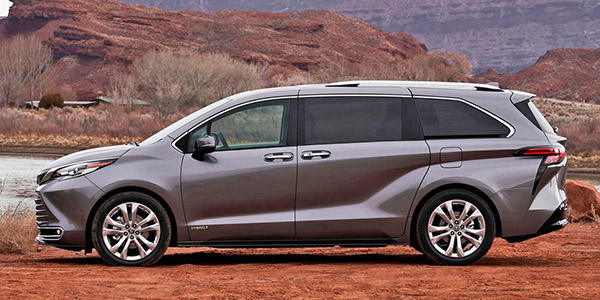
It has the weird”scoop line” over the rear wheel from the new Highlander. Which looks really odd in real life.
It also has that huge and mostly useless grille from the Avalon.
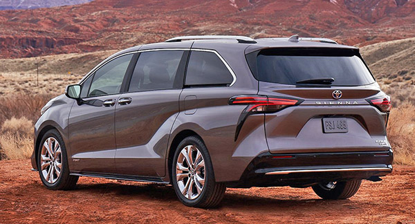
The droopy plastic trim at the edge of the rear lights, just like the Camry SE
This is like a blend of all the worst current Toyota design ideas.
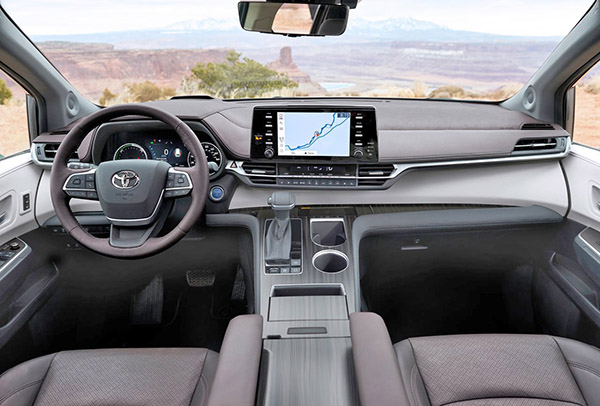
The interior is OK. Although it looks like 5 or more people worked on it and never talked to each other.
The screen is, of course, the laziest design and looks like a PepBoys aftermarket unit.
I think this makes the Chrysler Pacifica look even better…
The new Sienna is a hybrid-only model. With just one engine offered. The same 2.5 Liter Hybrid used in the new Highlander hybrid. (With 243HP) Which, apparently is pretty good.
I have seen reviews of the Highlander mentioning the Hybrid version is actually smoother and quieter than the standard V6.
So it should be fine.


the shifter and console are just terrible.. what a waste of space. it makes it look so tight in there. cavernous space under it but won't big items just fall out during cornering/??
you have enough space to do a 3-abreast seating in the front, there's plenty of room for a central air bag.
the exterior is just Toyota terrible, it tries too hard to be "designers" and fails! one other observation: there's no real bumper in the back, the bottom edge of the tailgate is exposed… minor parking lot bumps can result in expensive bodyshop visits.
I noticed that as well about the bumper. The same exact thing on the Venza! (Tesla Model Y and many others too)
Why? It seems bumper regulations are not a thing anymore.
I know it went from 5MPH to 2.5 MPH in the 80s.
But when did it go all the way down to 0???
What's with the giant black gloss bezel around the nav screen but with teeny chrome buttons. Is it even physically possible to reach the buttons on the right side of the screen? And black gloss and chrome way up high under the windshield. Fingerprints and sun glare galore!
Then there's that 2 level center console. First of all, do front seat passengers not slide into the back anymore? And that lower level will be hard to reach, unless it's for your giant purse. Smaller items will just fly right out of there anyway.
I think the swoop line on the side actually succeeds and helps to break up the mass, but the runny mascara from the taillights loses me. That didn't work on the Prius (and was eventually axed), and doesn't work here.
The rear end is just…..gross. The front only looks good in XSE grade due to the side scoops. Interior looks really nice to me!
Always a fan of those pre-dented doors. Makes parking lots so much less stressful!
Welp, this really makes the upcoming AWD Pacifica with the Red S package look mighty tasty indeed.
no front bumper either.. just that silly fake baleen grille that Toyota has on their cars… while Lexus has a pinched version of the same.
mark my words, one of the auto makers will eventually come up with a retro 80s/90s look with actual bumpers on their cars… things that can take a 5mph hit and not be damaged. enough with this overstyled nonsense that manages to look boring and generic.
Between the tortured contours of the sheet metal and the space robbing flybridge between the front passengers, this is a definite no for me.
There are no words for how vile this van is. The warped, cheap plastic is beyond anything that came out of the worst days of Pontiac. I try not to judge people based on what they drive, but Sienna and Camry owners make it so difficult to be nice. Toyota needs to hire adults to work in their design department.