2021 Hyundai Elantra: the good pix.
Last Updated:
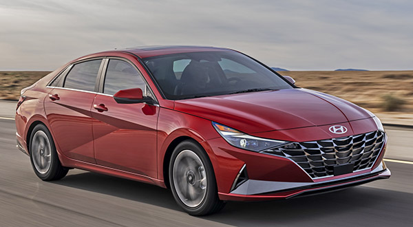
Looking pretty stylish.
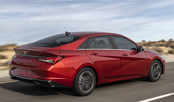
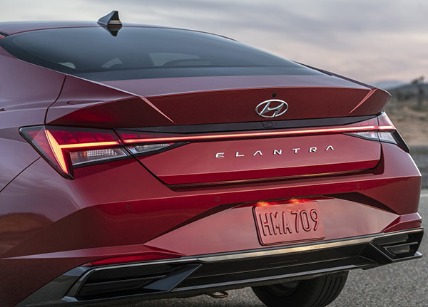
I really like how sharp the rear view is. Except it doesn’t really fit with the much softer front end. In my opinion.
No matter what, this is a huge improvement over the rather invisible current generation.
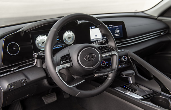
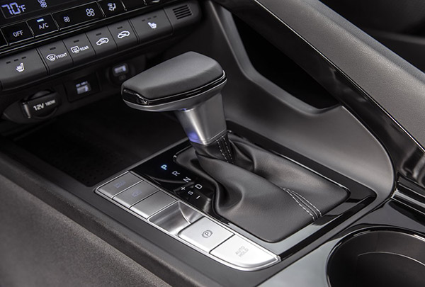
And the interior seems to be much nicer as well.
At the same time modern and pretty classy and looking quite upscale, at least on these pictures.
The huge black plastic piece that includes the screen still doesn’t seem that well integrated to the rest of the interior though. While everything else seems so linear, soft and peaceful . This big black plastic angular part sticks out a bit.
But it could also look great in person.
The standard powertrain is a 2.0 Liter engine with 147HP. Or about 10HP less than a 2.0 Liter Honda Civic.
But the same as the VW Jetta.
So it is fine for the class.
It comes with a CVT.
You can also get an “over 50MPG” hybrid version with a 1.6 Liter engine with 139HP and a 6 speed auto.
Which, if priced right, could be the best choice.
It is of course, longer wider and lower than the previous one. And roomier. Especially in the back where there is over 2 inches more legroom.
This is coming out at the end of the year. Maybe…



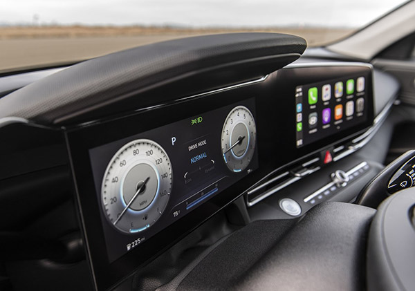
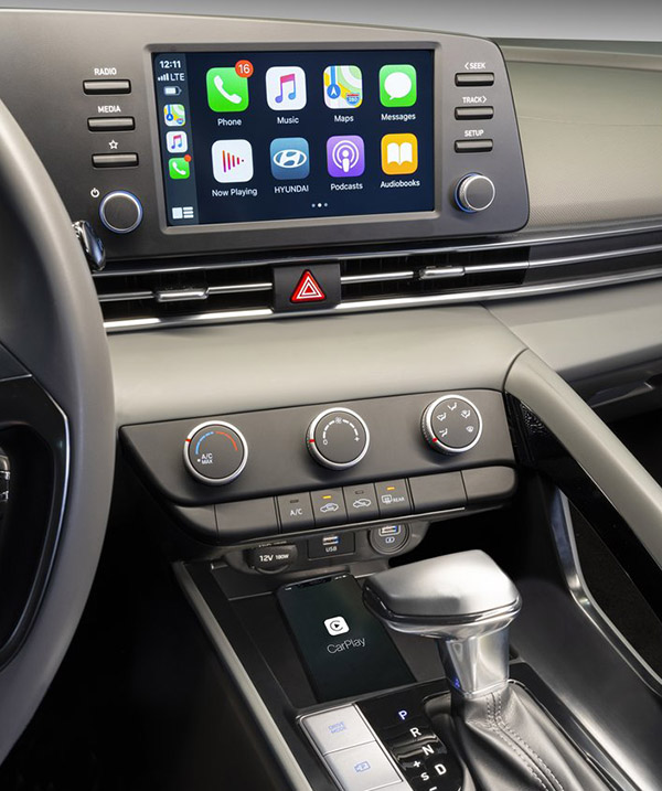
Show a pic of the base model screen. The plastic surround is not even glossy so it doesn't look like a giant curved screen like these pics. It looks like grandmas old tv.
Huge improvement over previous model and way more distinctive than it's Kia brother.
Good pix? There are no good pix.
I liked the teaser video and pictures that you posted on March 10th. But these new pictures don't look as good. I guess the shadows in the teaser video and pictures hid some styling awkwardness.
That is absolutely hideous! Interior is nice but stolen from the new Golf.
I like the back end and the interior in the high trim one, the interior in the cheap one looks horrible and the car dimensions looks so disproportionate…Also there's a mix of forms (sharp edges, lines, curves) that make it look like they didn't know what they wanted to go for when designing it. I need to see it in person but I think overall this car looks horrible. What is going on with Hyundai? They used to have nice designs and I don't think they have too many anymore. I saw the new Sonata and didn't like it at all either!!
What is the huge glossy panel to the left of the instrument cluster?
a face only a mother could love. hideous outside and cheap looking inside.
Anonymous @8:35, Hyundai confirmed that the panel to the left of the instrument cluster is just a "design element" and actually serves zero function. It's just a circle etched into the glass.
This is horrible! How can Kia make such good looking cars when their parent company is doing this ugly garbage?
I'd walk home through a coronavirus hospital before being seen riding in this monstrosity.
You can bet that the Tucson uses the same interior or something very similar to it. I also bet that the Sonata will get this layout too, especially the more attrative steering wheel from the Elantra.
Really dig the overall shape. rear and even front. But that side sculpting seems a little bit much for me.
Very cool that the doors come pre-dented. Will prevent parking lot anxiety.
guess i'm in the minority. i like it
guess i'm in the minority. i like it
The front end will make Lexus and Toyota design stylist happy that another car manufacturer copy their ugly front end look! This could be a Toyota model too.
Another one in the minority here, I actually really like it.
I really like it too. I think there is a little too much going on. the tail would look better without the angled creases in the trunk lid and I wish they had put glass instead of the black plastic on the rear window. But overall I think this design is a lot more cohesive and dynamic than the Civic and more stylish than the Jetta and Corolla. I still think that Mazda has the most beautiful designs of pretty much all of the major manufacturers out there now.