All new Hyundai Aura
Last Updated:
I was wrong about the new Aura in my previous post from a few days ago. It turned out to be a horrible looking car…
Of course, this is a very inexpensive model mostly for the Indian market. Where a lot of tiny cars seem to have the same “tall, narrow with small wheels” proportions.
So I am sure it will do fine over there.
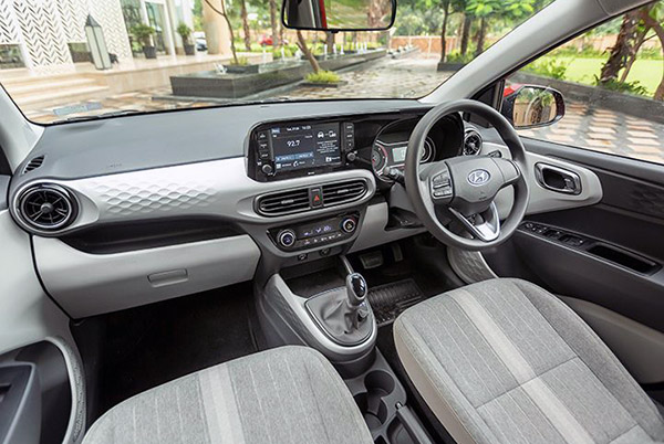
The interior seems actually really nice for its class. The screen is much better integrated than in almost anything Hyundai offers in the US.
And the whole thing looks quite modern and fun.
As a reminder, these are the ridiculous “official sketches” Hyundai showed us just a few days ago.

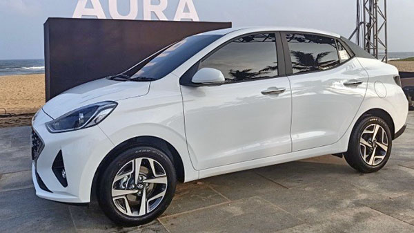
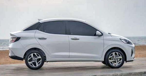
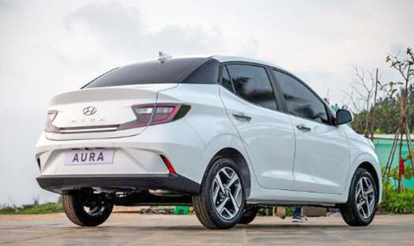
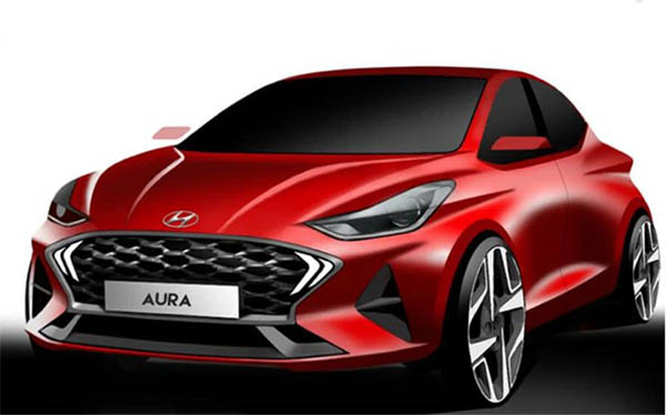
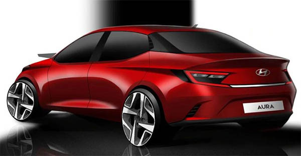
The first gen Toyota Yaris, reinvented with a floating roof, and adopted by a new manufacturer.
There must be some sort of "Concept Render Goggles" that work something like "Beer Goggles" for corporate automotive staff….
I can image marketing staff releasing the fantasy renders months before the production, but it makes zero sense to release those renders when they know how far the production model has strayed….
Why do all cars designed for that continent look so awkward in proportion? It's understandable that they may have narrow areas but so does Italy, and yet they are not so ugly looking. The Tata Nano is also vulgar looking.
OMG…those pics look like they've been squished. Geekiest looking car ever???
This is obviously the other Aura.
Make Me Rich.
I think they have or had a tax structure where the demarcation point was 4M in length. Found that on some Indian car site. Don't think we can post links, so I'm not.
Google "Reason Behind the High Taxation on foreign Cars in India" and it should be the first hit.
Above it, you were buying a big shot car and it was probably an import. Below it, it was probably domestically built (because who else in the world has plants that build cars that look like that).
Speaking total lack of …aura.