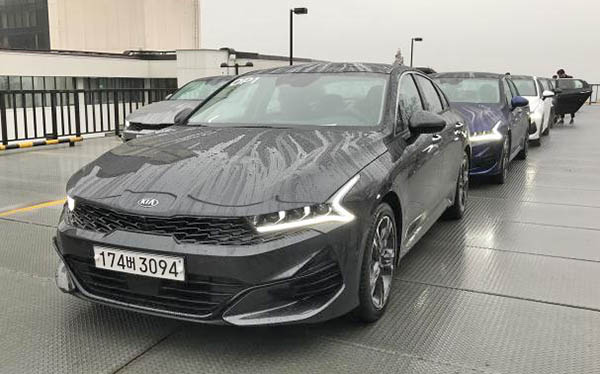
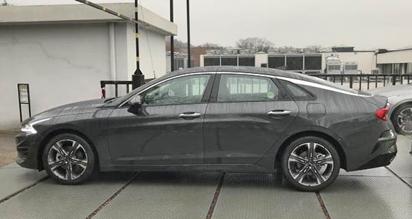
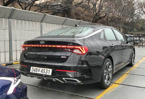
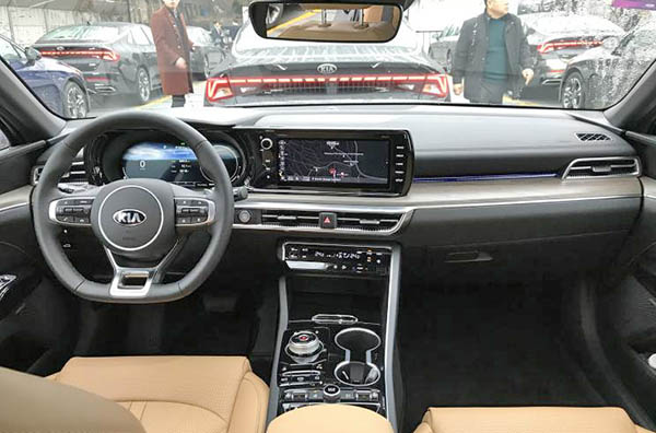
Some new pictures of a new 2021 Kia Optima. All wet.
Last Updated:
Of course, this design would have made a great looking hatchback. but no matter what, this is a very nice looking sedan.
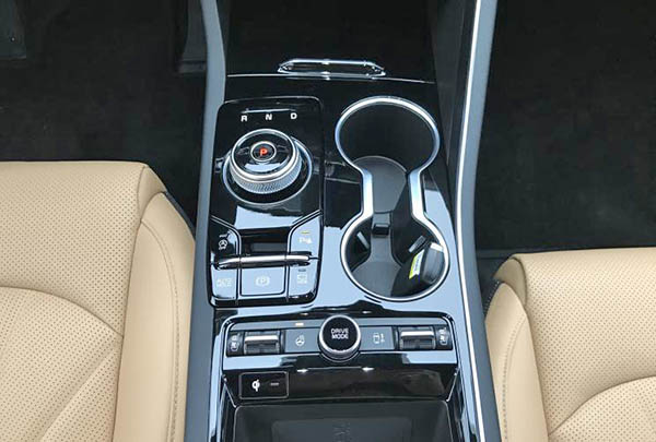
It is quite amazing how upscale it looks inside and out.
Of course, the one pictured here is probably the top of the line. And that means something around $35 000. But this interior really looks like it is from an upscale brand.
I cannot was to see this in person.
About the new Optima. I hear there is a rumor it might be called the “K5” around the world.
(the name it has been using in Korean and China for years.)
I think it would be a big mistake, and I don’t think the rumor is correct to begin with.
I have heard Kia will extend the K5 name to other markets. But it didn’t mention the US.

"This car seems flawless"
LMFAO. The comments on this blog are just priceless.
Wow. This is such a sloppy design. The surfacing, the graphics… all wrong. I bet Hyundai forced their hands on this so that the new Sonata would have less internal competition. The early Schreyer designs still look way more appealing than this mess. And i heard Kia hired the dumbass designer responsible for the latest, disastrous BMW designs, so their styling nadir is only beginning…
The rear window is practically horizontal. That is probably the ugliest looking back end of any car on (or soon to be on) the market.
Big win! As I said elsewhere, it's a poor man's Giulia, and there's nothing wrong with that. Hoping for AWD as an option.
Interior is upscale but exterior is plain jane!
Agreed with many of the comments, i don't get why this is supposed to look so great? I will reserve judgement till i see it in person.
As a HUGE fan of the past two Optimas (well, more the one before than the most recent) and the Stinger, I have to say this is a really big disappointment. The front is weird for weird's sake, the side view is pretty anonymous, and the rear just looks weirdly hunched/stacked (sort of like a Honda Crosstour) without any of the utility afforded by a hatchback with that look. The chrome piece that used to define the end of the greenhouse and sides of the rear glass has morphed into some sort of droopy canopy that makes zero sense where it meets the rear door.. had they thickened up the bottom part to meet the door almost horizontally it would have made so much more sense than melting into the window line as it does. Not sure what they were going for, but I don't think they succeeded.
Interior looks OK, but exterior (especially LED's front and back) look overly busy. I'll wait til I see it in person, but unlike the previous two generations this one looks worse than the Sonata.
close ups are so lame…
Exactly!!
This car seems flawless, with the exception of the 180hp 1.6T. Nothing the future 2.5T won't be able to fix though.
https://www.youtube.com/watch?v=lqfQP5HGIxw&feature=youtu.be