2020 Mercedes GLS
Last Updated:
While I do like the simplicity of the design, I just can’t help thinking this just looks like a longer GLE now.
Some suits at Mercedes are already describing the new GLS as a flagship model.
Which, I think, is a big mistake… As a “flagship” should be something more special than a longer version of your mid-sized model.
The S-Class sedan is still a true flagship.
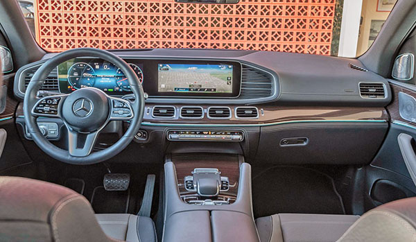
Here is the interior of the current, new 2019 GLE SUV.
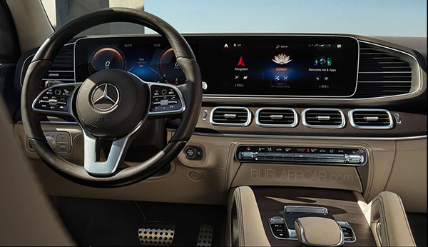
As you can see, this is exactly the same as the “new” GLS pictured in the pictures above.
So it looks like the GLS is now just a longer GLE with more seats. For probably a lot more money.
It is a cheap move that makes Mercedes look greedy.

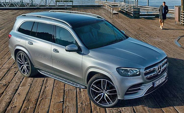
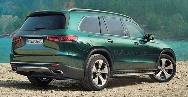
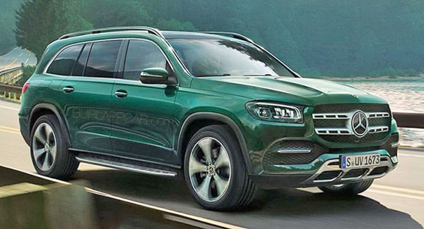
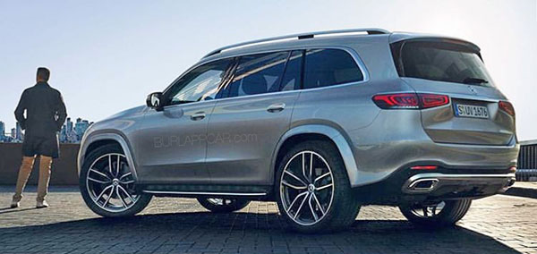
I guess I'm better suited for cheap Korean than expensive German cars, but boy, is that an ugly grille.
That’s basically what the GLS (and GL that preceded it) has always been, so this isn’t a surprise. Look back at the previous generations; they have always shared an interior with the GLE (and the ML that preceded it).
Right, Vince. So simple it's boring. About the only thing that says Mercedes is the three pointed star.
And as if fake vents flanking the grille weren't enough, they've now added one beside the infotainment screen. While I'm nitpicking, was it really necessary to have FOUR ventilation outlets above the center stack?
M-B interiors over the last 10 years were style setters, but with this and the new A-Class I really think they've lost their way.
The diehards at Stuttgart still pump fresh blood into the one and true MB SUV: G Wagon.
Anything below the S Class and G are just 'fillers' to keep the company afloat.
I'm just saddened that the M-B "sport" grille opening and horizontal "coupe" taillights have pretty much permeated the entire lineup (save for the S-class and luxury-trim-optioned E-class). That huge three-pointed star used to promise exclusivity and style, yet now it's slapped on everything from the A-class to the GLS. And IMO utilizing the somewhat vertical taillight shape like most of Mercedes' core sedans would look very nice and distinctive on the GLS and non-coupe GLC and GLE.. but they insist on the coupelike lights on all their SUV products. It is sad to see how boring this brand has become.
It makes the Cadillac XT6 look really good. They at least put wood and fabric in new places when re-using the XT5 dash.
you're assuming that people care whether there dashboard design is different between the two models, which [checks notes] nobody gives a shit about.
I'm okay with Swagener's endeavoring to simplify the designs but this thing is positively bloated. Needs to pop a couple of maximum-strength Pamparins.
The tailgate looks like it has a sphincter.