2020 Hyundai Sonata
Last Updated:
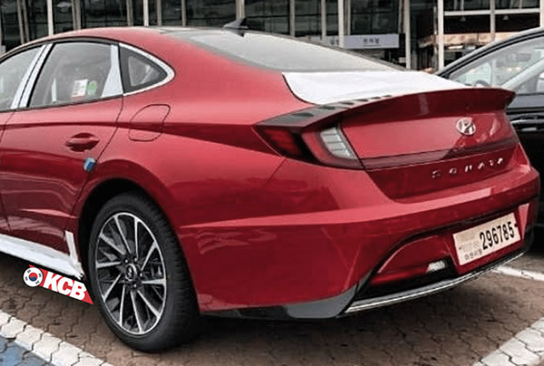
It is still hard to say how the rear end actually looks like.
It seems droopy from some angle. And not otherwise.
Still too bad this is not a true hatchback (At least I don’t think so)
No matter what, it does seem like a huge leap from the current one. With quite a personality…


Vince,
It's just a VW Arteon wanabe. The designers are German, obviously they ripped it off the Germans.
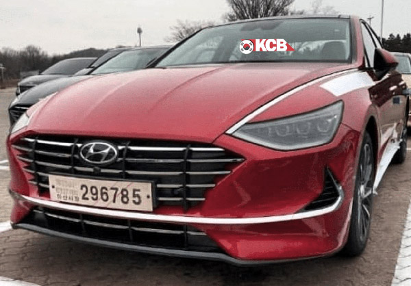
That is one ugly front end.
The new Sonata rear looks strange with a conventional trunk instead of a lift back door. Kind of like the 1950s style rocket flare rear brake/lights. Looks still much better then anything in it class. Better then the Accord, Camry, Altima, Passet, Legacy, etc…
Not sure about the rear end, but that front is absolutely gorgeous. And design-wise, this car is definitely best-in-class…way ahead of that cluttered-looking Camry and awkward-looking Accord!
i think it looks great. If it did not have the Hyundai badges front and rear, i doubt most people would guess it was a Korean vehicle. Looks upmarket European .
The trunk looks like it's much lower than the base of the rear window. Reminds me of the 96 Taurus/Sable (which, of course, got criticized for trunk space and the trunk lid was raised a few years later).
That Taurus rear looked terrible, like it was taken from a small car and stuck on.
If it were a hatch, they could raise the metal part and add a vertical window as on the Prius and Maserati Khamsin.
The whole rear end is awkward.. the rear window looks like it came off a Jag F-Type (which is a proper hatchback) and the trunk dives down like a Lincoln MKZ.. not sure how well this will do but I give them credit for trying. I fear the Optima version will be much less interesting (where they should be the one living up to the previous model's daring styling).
Mission accomplished as you can tell by the number of comments on this article. Hyundai has created a very sophisticated in upscale design. Easily surpassing Honda and especially Toyota. Hyundai once again has raised the bar and look for others to try to follow. Hyundai is once again the benchmark of midsize sedans.
What a mess
Looks good today but this design will not age well
The sharp straight lines on the trunk lid itself, i.e the reflector lights and the lower edge of the "spoiler" are too straight for the rest of the design. Definitely needs a trunk redesign already.
I'm not sure how Hyundai settled on this design. The front looks like a teenage girl who discovered makeup for the first time. It's just so messy and amateurish. The rear, well… hopefully the car has a good personality.
Holding off my final opinion until I can see it up close and personal.
I didn't like the 2015 when it came out, but I ended up buying a '17 sonata.
Now I own an '18 model.
I think this new gen Sonata looks very sharp! It just may be the best looking mainstream midsize sedan when it hits the market! Hyundai definitely has its design mojo back!
The front end is pretty nice (very Genesis-like), although the integrated LEDs (whit line) that go some of the way up toward teh windshield look odd in the daytime.
The back end looks confused. What are those plastic bumps doing on top as part of the tailights/spoiler?
The trunk does look like very stubby—-like you have to crawl way down to get your stuff out it. Not cool.
The Kia Optima has always been the sportier, sleeker cousin of the Sonata
so I wonder if this means that the redesigned 2021 Kia Optima sedan (they're always a year later) will look way, way out there and a bit crazy.
At least it will be of better quality than a VW Atreon 😊