Jaguar XK
Last Updated:

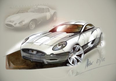
This is a sketch from 2005. Showing us “what could have been”.
I like it much better than the end result.
Much more Jaguar.

Last Updated:

This is a sketch from 2005. Showing us “what could have been”.
I like it much better than the end result.
Much more Jaguar.
i disagree that looks like a terminator edition
I also agree with Vince.
The current one is really nice, but a little flat in some areas. The cone facial is so much nice and more in line with Jag styling. Maybe next time Ian Mc kellen (spelling?) or hire Chris Bangle for some funky curves :)=
PS- Any news on the Matrix/Blade, Vince?
I think this looks pretty close to the production version. Renderings are always much swoopier than the end result. But this is a pretty good interpretation of the real thing… or vice-versa.
When I saw a new XKR on the road, I was really amazed at how sleek and modern it actually looked. In my opinion, the photos don’t do the new XK justice.
Ian Callum is his name.
And I think that the current XK is not all that riveting, especially considering the new design direction Jaguar is embracing. That sketch (save for some of the overwrought detailing) looks pretty sharp.
I love the new XK….everything except for those ugly tail lamps.
The shape of the tail-lamp housing itself is fine, it’s just the odd, cock-eyed detailing with too many switches from red to clear….
“I love the new XK….everything except for those ugly tail lamps.
The shape of the tail-lamp housing itself is fine, it’s just the odd, cock-eyed detailing with too many switches from red to clear….”
I agree completely~!