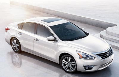
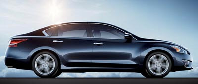
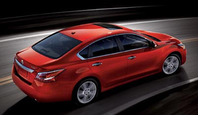
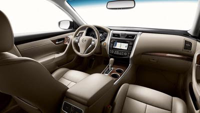
2013 Nissan Altima.
Last Updated:
Looking really good on these pictures.
It could have been a big Versa or a small Maxima. And it does look like the Maxima.
A great move.
And in another great more: 38 MPG HWY/27 City for the 2.5 Liter engine with 182hp.
The V6 with 270hp is still on the option list, and gets 22/30MPG. Still really good numbers. Just 2 and 3 less than the Sonata 2.o Liter Turbo.
Which is pretty amazing, and better than anything else in the class.
This for $21 500.
It looks nice. Where is the moron, who "works for Nissan" and suggested that it looks like the Versa? Is he hiding?
Wow , truly stunning car!
What is with the love affair of having a tasteless chrome mustache on the rear trunk lid??? That feature ruins the sporty look of the Maxima and yet they continue with new Altima. These aren't crappy Cadillacs.
Stunningly elegant
Yeah, I really don't think this is all that great. The interior is boring, and it looks like a mini-Maxima with the Lexus spindle grill.
This is anonymous, but anonymous sells in the US. I am sure it will sell in vast quantities to fleets too.
More of a design makeover than Camry but still quite boring and nothing new here.
But in this segment it seems that's what people want (e.g. Camry, Passat, …).
I'm not as impressed with interior other than nice electronic gadgets. In closeup photos you see cheap plastic and (lack of) design curves are still as bland as current model.
MPG is quite impressive.
luv the chrome trim especially on trunk lid, it's like a cute moustache if u will, lovely!
yeah – take out the shiny piece above the license plate holder. but it's a great design, tho the front wheel arch should have been repeated on the rear wheel arch for consistency, just like on the Murano…
" These aren't crappy Cadillacs."
Or Mercedes or Jaguars, or Mercedes or Audis. By the way, a Nissan is way lower than a Cadillac. In spite of what you think.
Agree w/6-speed. The gratuitous chrome bar just cheapens any design. It is disappointing to see some car makers even slap on these on the trunk lids during mid-cycle model refresh. I guess some focus groups told them that the chrome bar adds 'class'. Ick.
Looks nice, certainly better than either the Camry or the (just a minor update concept) 2013 Accord, but hardly in the same aesthetic league with the Optima or 2013 Fusion, and I'll have to experience those MPG numbers for myself before I believe them.
looks like a Buick
yeah, its not overstyled!!! hopefully, they keep the attempt at creating the nike swoosh with led's out of the headlight / tailights…
Interior appears to b a huge upgrade. Yeah! The exterior is evolutionary and very Nissan–which in this case works. It is certainly miles ahead of the new Malibu and Camry (dull and conventional) and should look good up against the new Fusion and the Kia/Hyundai mid-size car cousins.
Anonymous Anonymous said…
"It looks nice. Where is the moron, who "works for Nissan" and suggested that it looks like the Versa? Is he hiding?"
Okay, well, first off, you'd read my post I said it looks like "THE VERSA HATCHBACK" that will be shown to the public soon. I also said, it would look better than the teasers were suggesting. Suffice to say I was right about that. Wait till the VERSA HATCHBACK is released before spouting off. At which point, discredit me all you want.
These pictures are photoshopped to hide awkward lines. Compare these to the photos directly taken from the NY autoshow. I don't know what to believe thesedays anymore.
The dash and interior look very upscale.
this will undoubtedly be the word's best midsized car.
This ties with the Avalon and the Lexus ES as the most boring car introduction in NYC. They'll sell tons of 'em to people that are slightly less boring than Camry owners. But it still sucks.
so droolworthy….
The dropping line at the front door absolutely kills the look. What mentally retarded child – aka, Design Twit – thought that was stylish?
The interior is a great step up!