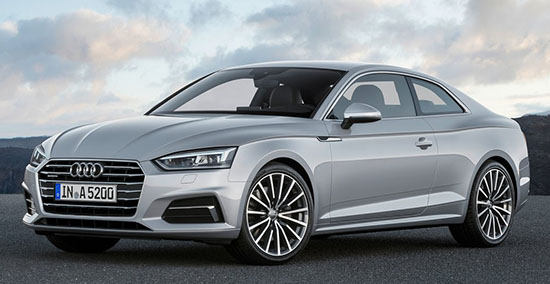
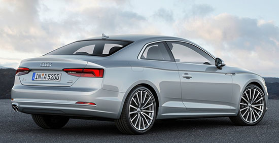
2017 Audi A5: The good pix
Last Updated:
Now we’ve seen it.
And here is the first picture of the sad interior. Which is, unfortunately, carried over from the new A4.
The console is OK. But that flat dash is just too boring and sad for me.
There is zero effort to make it attractive. (Just like the new Q7)
I am sure wood trim might dress things up a bit ( Cannot believe I am actually praising wood trim)
Otherwise, this is “new Jaguar” level of sad…
And the door panels! It looks like they just ran out of ideas and went for “flat”.
This is really bad, especially when compared to companies who are actually trying hard, like Volvo.
The new S90 interior is light years ahead of this…
The A4 does offer 2 other wood inlays instead of the chrome so probably also offered here? The S5 appears to have carbon fiber look.
Don't have a big issue with the interior. Not fond of Volvo S90 design which looks too blocky/heavy to me but just a matter of personal preference.
Very pretty
How can Audi expect anyone to get excited about this??
The "New" A5 looks just like the previous one… ditto for the "new" A4.
Yes, the interior has changed. But on the outside, almost nothing is different.
What a letdown.
I love the exterior styling, and the interior seems understated and uncluttered. I like that, too.
I don't like that the exterior looks very similar to the old one, it looks old but not very different. Now, the interior, that I think looks light years better than the old one.
is this the old one or the new one?