2018 Lincoln navigator Vs. 2016 Concept.

Last Updated:

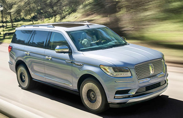
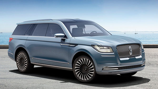
 At first, the production model would seem very close to the concept.

It is…
But the concept was actually a much better, more mature design.
Much simpler too.
The detailing on the
 production truck is very busy. Which makes it much cheaper looking.
For instance, they could have kept the profile the same. With maybe recessed door handles. At this price, why not?
The headlights are much cheaper and chinzy looking.
The whole thing has a busier, cheaper and more vulgar appearance than the concept. (Which was nothing that amazing in the first place)

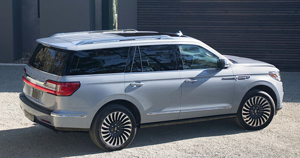
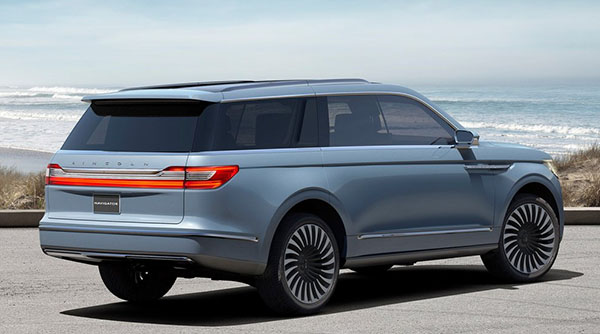
 It’s even more obvious from this angle.
The tail lights had a really nice, simple, classy, almost retro design.

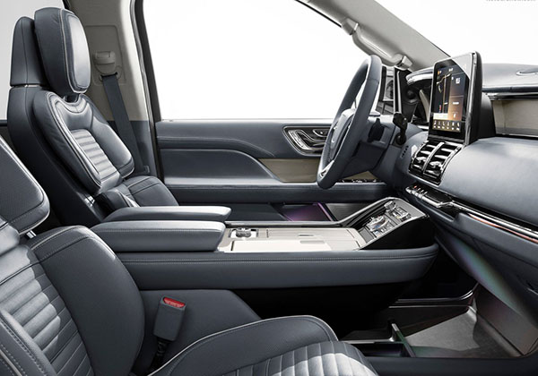
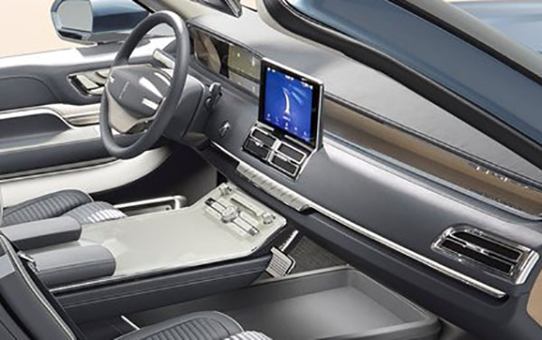
 Inside, it’s hard to say from the early pictures.
But it looks like all that classier satin metal finish has been replaced by the plasticky extra shiny chrome. Just like in the Continental.
And it doesn’t’ look like the super cool steering wheel from the concept made it into production either…

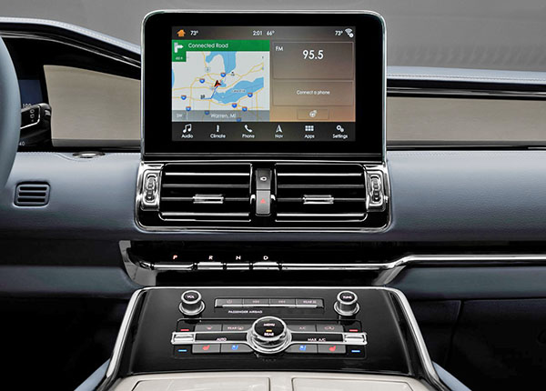
Lots of plastic-chrome here….

Conversation 10 comments

  1. I think it is not that bad, I have seen worse transformations outside. I even think it looks more e"Bentley" than the Bentyaga (which really is just an Audi with changed sheetmetal below the belt line).

    The inside looks good at first glance, but there is indeed too much shiny plastic in details, and plastic chrome instead of mate metal finish. In times where every 99$ Chinese mobile phone can afford a metal housing, I ask myself how much more real materials would cost as detailing. Also I'm uncertain what the light beige material is on the door and the center arm rest, probably supposed to be some light wood similar to stuff Volvo uses on some trims, ut if it looks like plastic on a small photo taken from a distance and gone through photo shop, it moist certainly is plastic….

  2. I think it looks pretty good! The production model is pretty close to the concept, although the production model would have looked better using the concept's sleeker and slimmer tail-lights. The interior looks better than the concept's. Obviously they had to go with the corporate steering wheel, instead of the concept one.

  3. I think many of the changes with the lights are related to engineering and regulations. Interesting that the outer tail lights are more blocky than they should have been, but the headlights are pretty much what I was expecting. Looks like that the visible C pillar is gone, which is ok as it's prominent on the Expedition and these things need SOMETHING to differentiate the greenhouses…its 2017, not 1990. I'm surprised they kept that line under the headlights from the concept. It does help break up the front end and keeps it less bulbous.

  4. Ok.

    I think the concept has translated quite nicely into the production car. I'm especially impressed by the interior. I'm not a fan of the exterior, especially the grille…

  5. You're being too hard, Vince. I think it's a great transformation from the concept. Plus, it looks far better than the Caddy Escalade!

  6. I've gotta say that I disagree here. While it has certainly been struck by the practicality stick of production (adding cup holders, cubbies, reflectors, non-gullwing doors – ha) I think they did a phenomenal job staying close to a beautiful concept. When comparing this with an escalade, I think it is weaker from behind but much stronger everywhere else – especially that interior. I'd say bravo, though this is not my class of vehicle by a long shot.

  7. I actually like the beast! Even the interior is refreshing considering it's still based on an aging dinosaur. The ONLY deficit is they should have incorporated the Continental's door handles into the doorframe – THAT would have made this something special; somewhat truly contemporary.

Leave a comment

Your email address will not be published. Required fields are marked *