Untitled Post
Last Updated:
Finally.
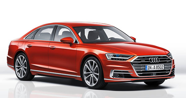
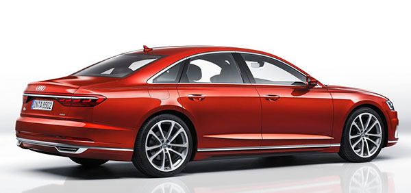
Here are the first official pictures of the all new A8.
And it is…. Just like what we saw before.
The exterior is very similar to that wagon concept we saw. Which looked like any other Audi designs for the past 20 years.
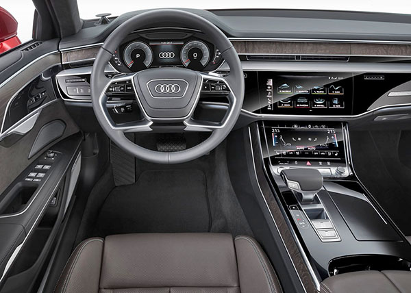
The interior reminds me of a modern version of 70’s or 80’s Buick’s. Where the dash was so flat.
But now with LCD screens everywhere.
There seems to be a total lack of style to the whole thing.
But again, that was expected…
Holy Cow, 13 years ago called… it wants its style back.
Audi needs a new design lanquage pronto
I'm sure the technology and fit & Finish is top notch, but this thing is soooo mind numbingly boring to look at. And you're right, the interior besides looking modern is the same slab sided look Buick and Cadillac had 20 years ago. Also, it might be just me but that nav screen is too low and likely will contribue to distracted driving as the driver will need to take their eyes off the road to view.
Apparently, Audi called this their brand new design language…
Well, when a 2005 Hyundai Azera is apparently your inspiration, you cannot ask for too much….
It looks great. What do you guys want it to look like? 20 year old audis still look better than most modern cars anyways.